TC#9: SPEAKING Truth* to Power - ISSuE-BASED ART
* Truth - subject to change, opinion, histories, conflicting ideas ...
ABOUTThis resource has been designed for KS3 teachers and students (Term 3) and links closely with Threshold Concept 9: Art makes people powerful, for good and bad
KEY THEMES• The artist as activist
• How art influences the thoughts and actions of others – for good and bad • How art can be transformative - personally, locally, nationally and globally |
IN PICTURES
The images below have been chosen to encourage initial reflection. Consider them carefully and then use the following questions to help discussions.
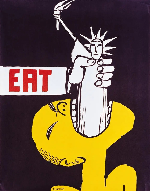
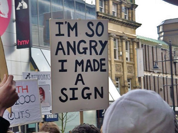
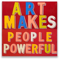
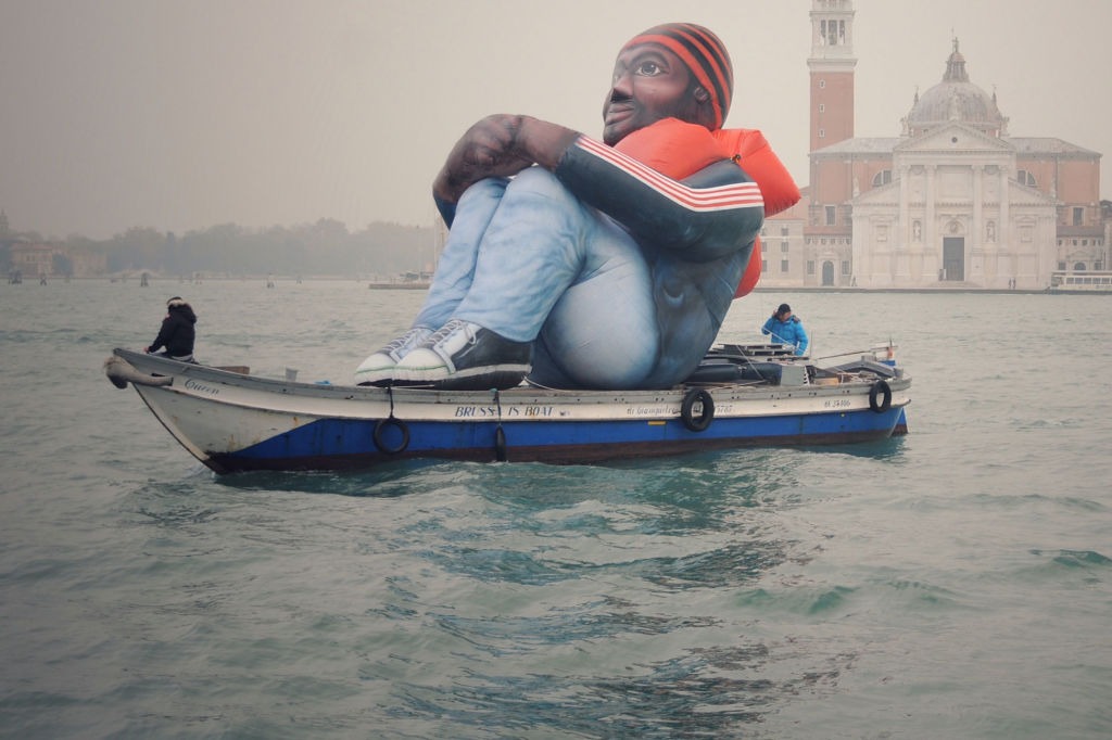
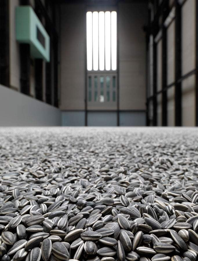
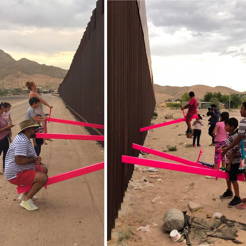
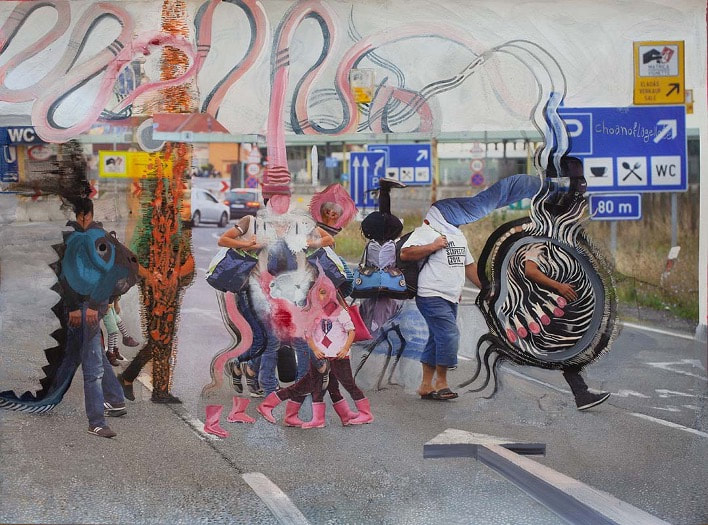
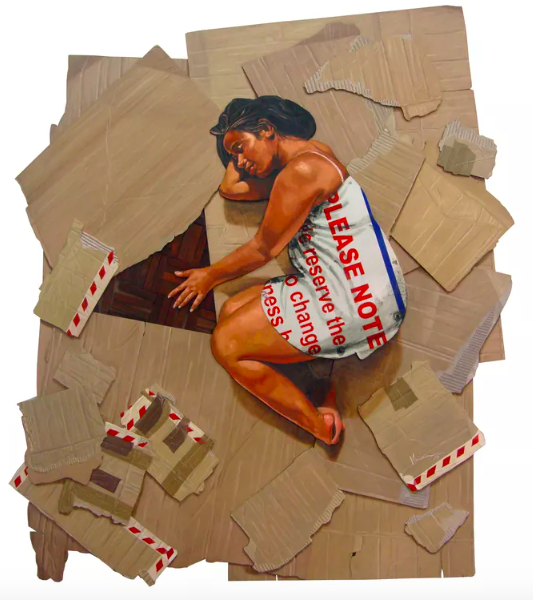
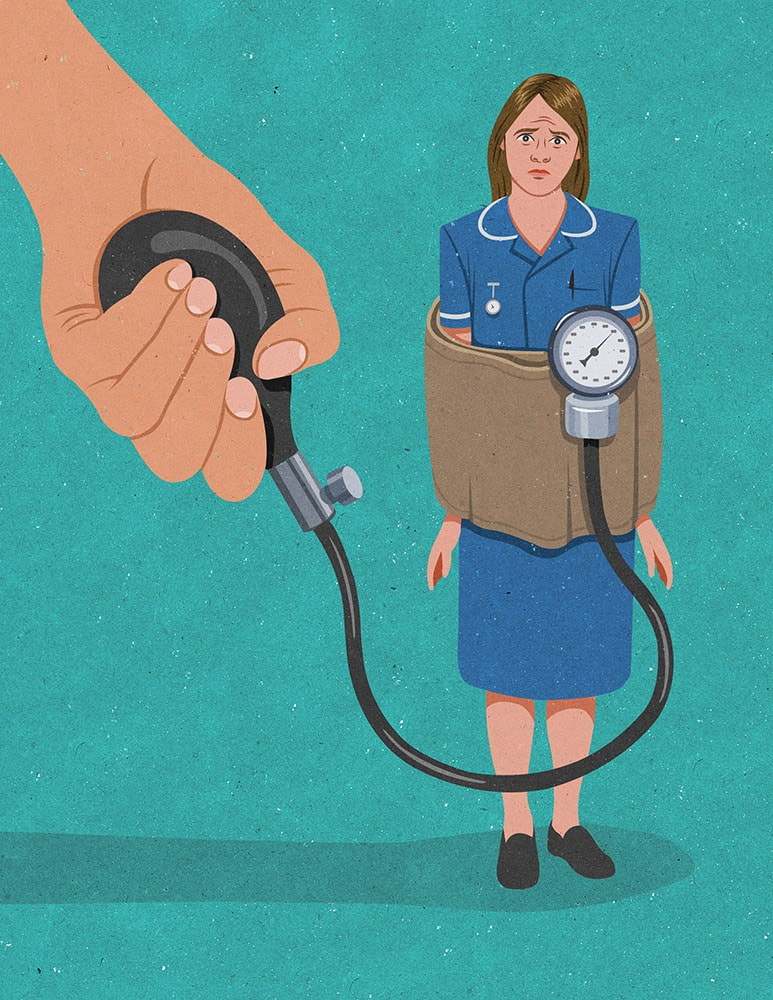
Scroll over the images to reveal the artist's names, also listed here from top left. Click on the names to find out more. 1. Tom Ungerer, Eat, 1967, an anti Vietnam-War poster; 2. Unknown artist, Protest sign; 3. Bob & Roberta Smith, Art Makes People Powerful, 2015; Schellekens & Peleman (Artist Collective), Inflatable Refugee, 2017; Ai Weiwei, Sunflower Seeds, 2010; Rael San Fratello (Architect Studio), Teeter Totter Wall, 2019; Rokni Haerizadeh, Where to? Wherever it Chances, 2019; Vivien Kohler, Those Who Dream, 2014; John Harcroft, illustration for Nursing Standard, 2018.
IN DISCUSSION
The images above have been broadly grouped into 3 approaches: the top row shares 3 different protest signs/posters; the middle row shares artworks/installations that might be described as socially engaged practices - these works were created as proactive acts of collaboration that included or invited wider participation; and the bottom row are artworks that might be described as more illustrative and/or satirical.
- Which of these works has the most direct impact upon you in how it makes you stop, think and reflect?
- Which of these works is the most challenging to immediately understand? How/why do you think these various artworks were made?
- Is it possible to identify the specific issues that these works are in response to - and what the intentions of the artist(s) might be?
IN words
The following words might prove particularly beneficial to this project. Identify which ones are unfamiliar and look these up or ask your teacher to explain further:
- Visual elements: line, shape, colour, form, space. Composition, layout, balance, tension
- Editorial illustration, commission, satirical, graphic; propaganda, dissidence, manifesto, protest, degenerate; performance, installation, collective; issue-based, transformative, socially-engaged practice
In THE ARTROOM
The following activities are to help you explore these themes in practical and collaborative ways. Your teacher will advise on which tasks to focus on in class and/or at home.
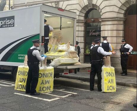
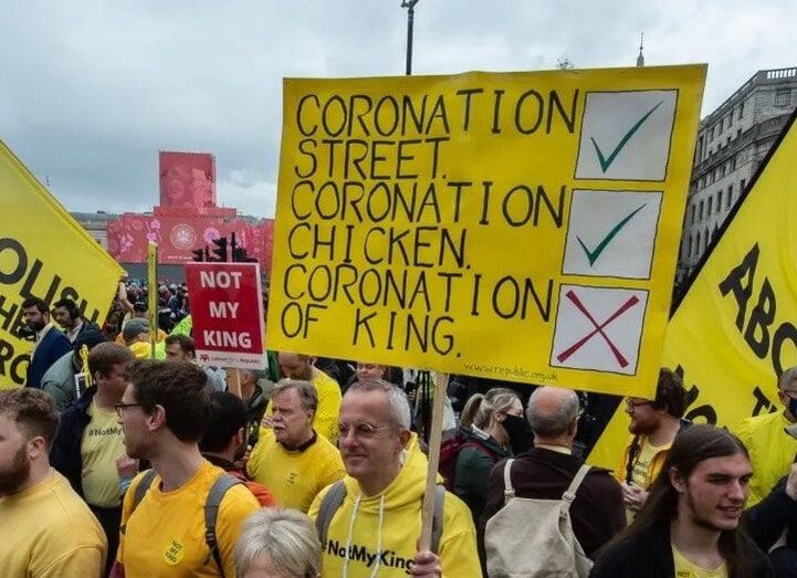
The right to protest peacefully, collectively, and to voice your opinion (freedom of speech) is a fundamental human right within a democracy and is set out in Article 11 of the Human Rights Act. This freedom has been called into question in the UK, most recently with preventative arrests being made prior to the King Charles's coronation. Peaceful protests can provide opportunities to raise debate, hold the powerful to account, and to challenge opinions. Protests can be contentious and disruptive. They can also be celebratory, uniting and humorous.
- Collaboratively devise a set of rules, laws or guidelines for public protest. These might be reasonable, essential, constraining, surreal or plain silly. Consider how and where you might document these, be it in a playful or profound way.
Signs that say what you want them to say
The title for this task is partly inspired by an artwork by the artist Gillian Wearing. We won't look at that here now, but if interested do follow this link. It does raise some valuable questions about written signs and wider contexts - how text-based signs, especially personal ones, might influence our thinking, provide further insights, or even add increased complication or confusion to what we see - because words, like images (and words as images), are open to interpretation and are not fixed in meaning. Context is everything.
The title for this task is partly inspired by an artwork by the artist Gillian Wearing. We won't look at that here now, but if interested do follow this link. It does raise some valuable questions about written signs and wider contexts - how text-based signs, especially personal ones, might influence our thinking, provide further insights, or even add increased complication or confusion to what we see - because words, like images (and words as images), are open to interpretation and are not fixed in meaning. Context is everything.
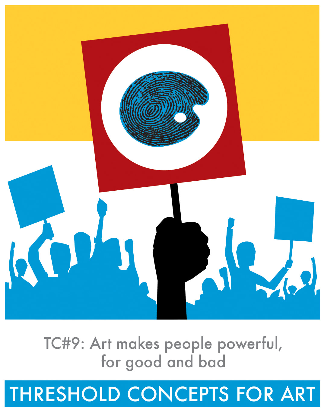
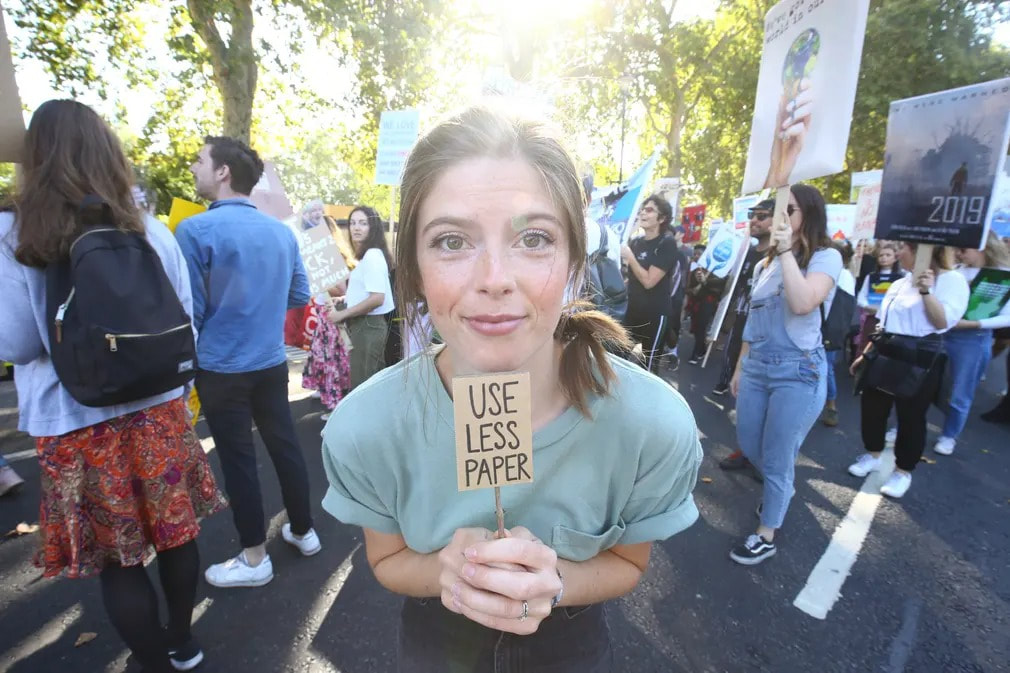
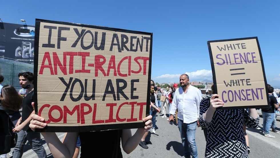
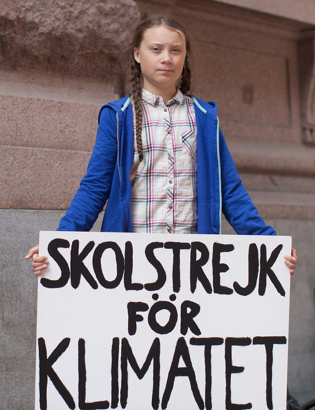
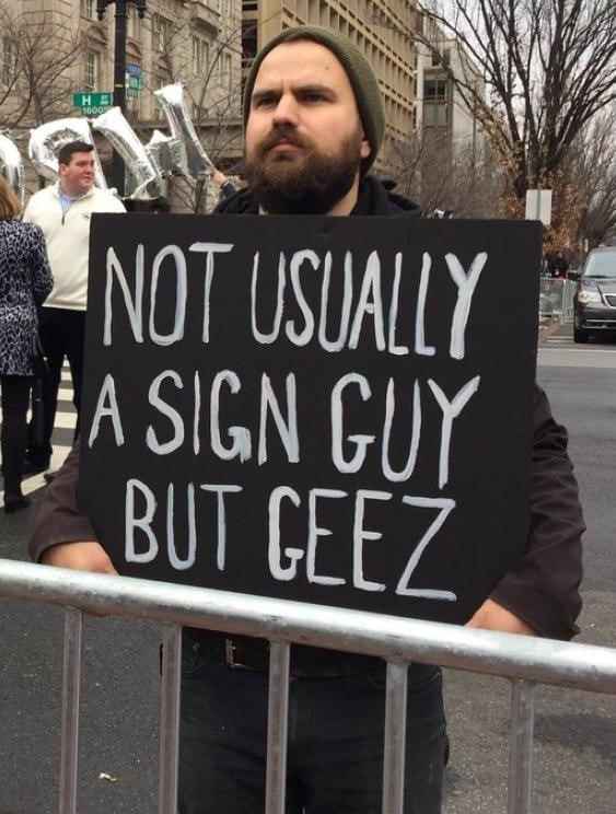
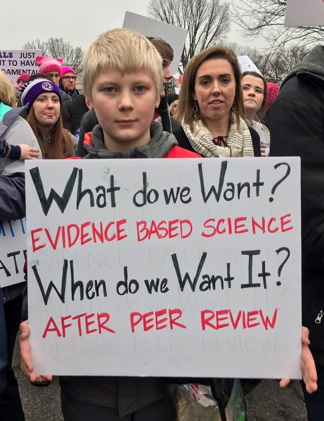
- Look carefully at the TC#9 illustration above. It appears to be a protest march of sorts. What issues, concerns or injustices (personal, local, national and/or global) do you feel strongly about, perhaps strong enough to protest?
- Write a list of these issues, which might range from the seemingly insignificant (to others but not you, obviously), to more widely publicised concerns. Try to choose 5 and, if possible, list them based on your strength of feeling for these.* Research your chosen issues carefully to build your understanding.
- Use a square format for this task (as in the TC illustration, so you can then present it within this graphic). Choose one issue that's important to you and ... Design your own protest sign using:
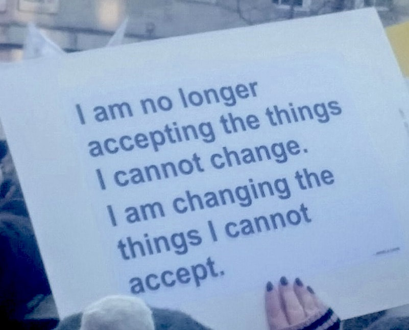
1. Text only, no images. For this, think very carefully about your desired effect and how you might condense a powerful, poignant or potentially entertaining message into just a few words. See the slide show above (slides 3 and 4) and images below for help with this. The words, punctuation, font/handwriting style(s), composition and colour choices can all play an important part - which is not to say it has to be perfect either; sometimes protest signs are most effective because they appear immediate, urgent, heartfelt and authentic.
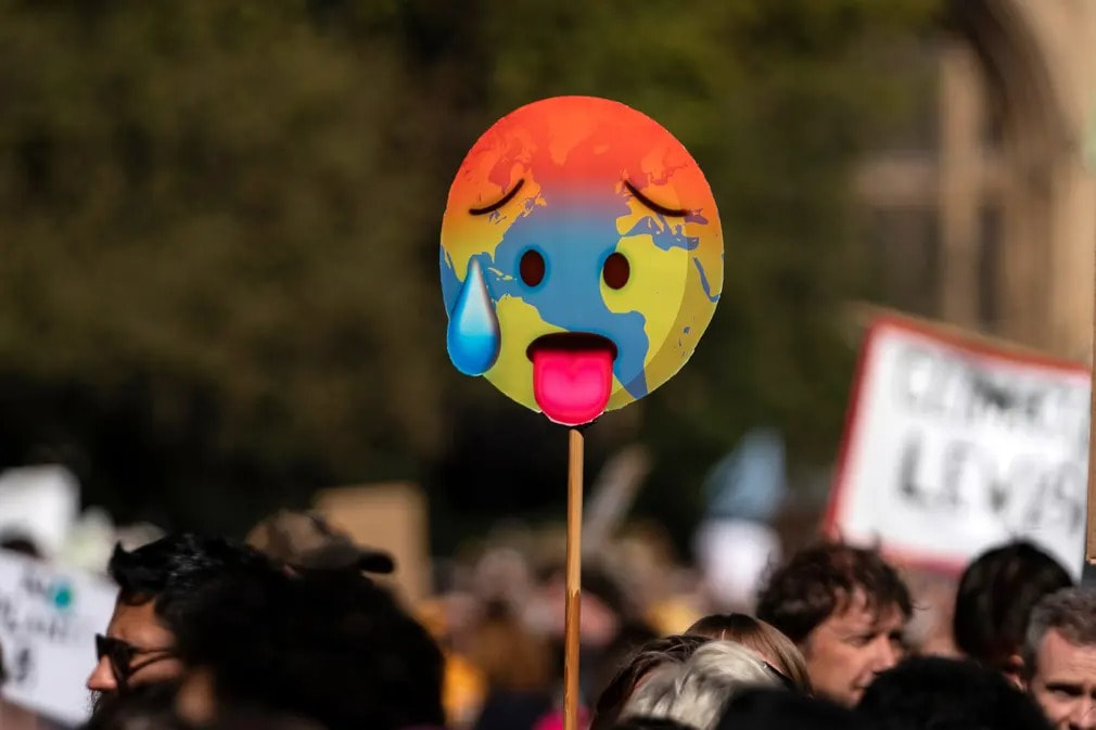
2. Image only, no words. For this, think very carefully again about how you might represent your issue and take on this, but only using graphics/imagery. Some issues and injustices have generated dominant images/icons, sometimes utilised or pre-designed as logos. Below are a few examples. Which ones do you recognise, what do they represent, and how do you think they came to be?
Hands - signs, symbols, gestures
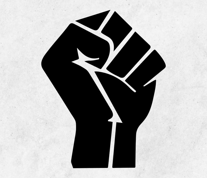
One of the images above shows a clenched fist. It's a powerful symbol synonymous with the Black Lives Matter Movement. The clenched fist has a long history as a symbol of protest against fascism, racism, inequality and injustice.
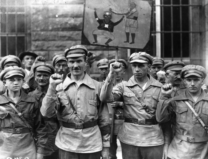
The image below shows members of the anti-Nazi Red Front Fighters giving a clenched fist salute in 1928. Look carefully at the interactive the protest poster held in the background - it shows a clenched fist on a moveable arm, seemingly to hammer on the head of Nazi-uniformed guard.
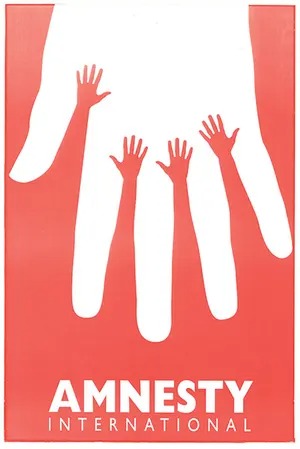
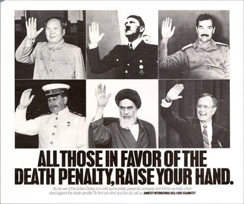
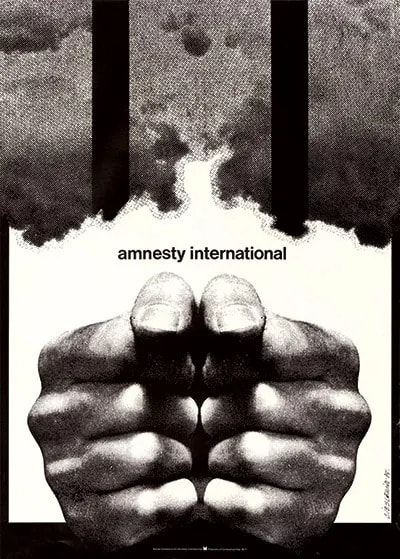
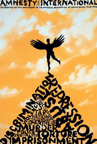
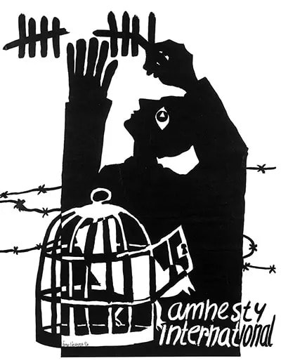
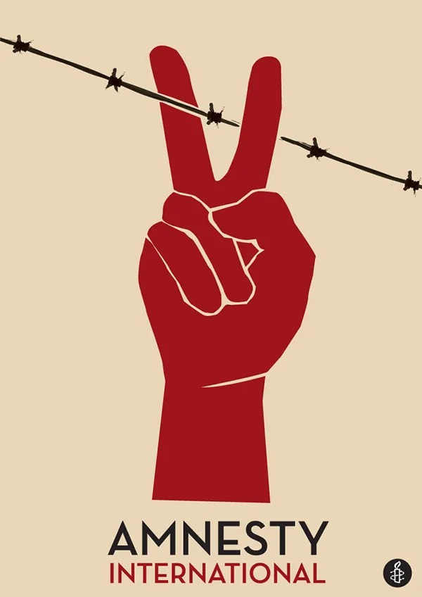
A human hand with its various gestures has the potential for powerful symbolism and expression. Below are a range of Amnesty International posters that use hands to powerful effect/to powerfully affect. Amnesty International is a worldwide organisation dedicated to equality, justice and positive change.
Click on the images to see full versions. Use the notes below to help you think carefully about these posters.
Click on the images to see full versions. Use the notes below to help you think carefully about these posters.
The posters, above, use hands to represent or suggest something else - be it actions, objects, ideas or ideals. In one, a peace sign also suggests a pair of scissors; in another, two fists manage to suggest both containment and power.
- Spend a few moments carefully analysing each poster. Make notes for each of these under the following headings:
Visual - which visual elements have been used (e.g. colour, line, shape, texture, tone ...)? You might also consider the composition/arrangement of these.
Technical - what materials or techniques/styles have been used?
Contextual - what wider information do you know, or can you gather, that helps understand or explain the poster? For example, do you think these relate to specific injustices or campaigns? What meanings, understandings - or actions, even - do you think Amnesty wish to evoke or provoke?
Personal - which do you think is most effective and why? What do you think or feel about each poster? - Produce a series of carefully observed drawings of your hand in various poses/gestures. Think carefully about the positioning of your hand and how your use of line, shape, tone or texture might help to emphasis, express or suggest different things. Below are various examples of artist work to help with this task.
|
|
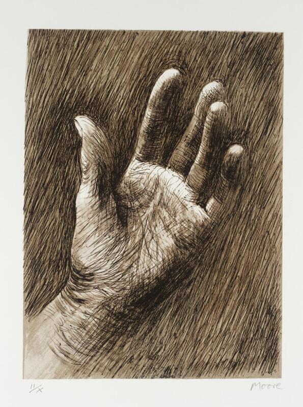
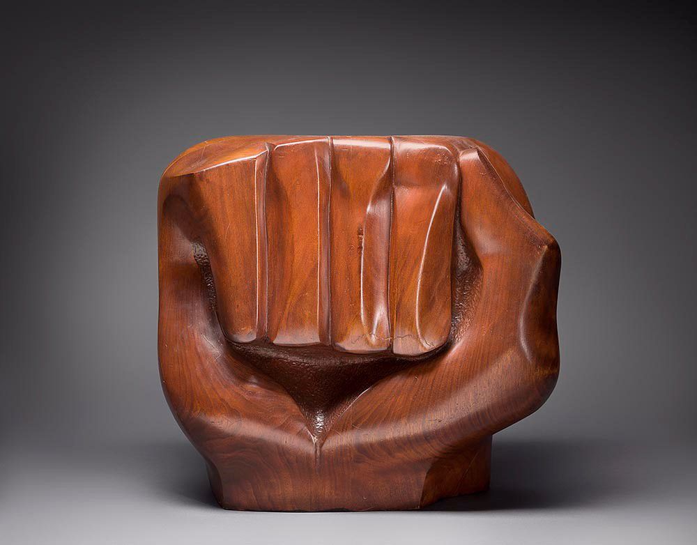
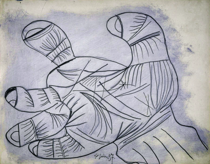
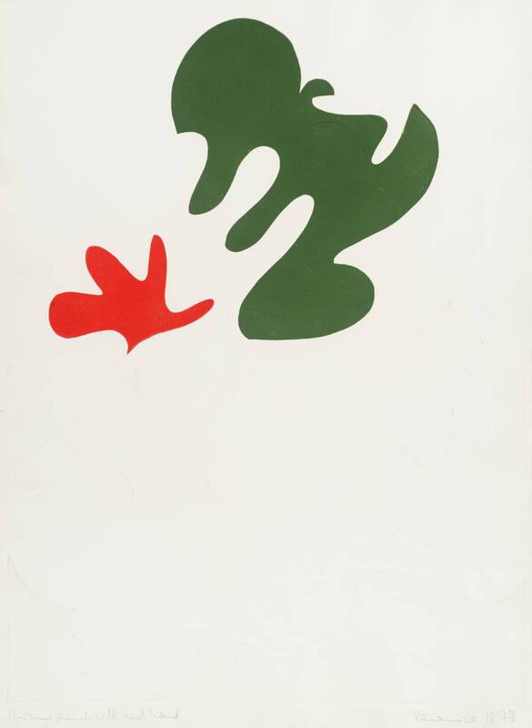
Here are a range of examples of hands by various artists, also used in this TC6 resource. Click on the images to enlarge. From top left: Henry Moore, The Artist’s Hand, 1973; Elizabeth Catlett, Black Unity, 1968; Picasso, Hand Study for Guernica, 1937; Berenice Sydney, Monoprint with Red Hand, 1973 Which groups of words best help to describe these different representations of hands? What words would you add or are uncertain of?
How might these various styles and techniques inform your choices for making a more developed artwork - one that uses an image of your hand to powerful or purposeful affect? |
Beyond the poster - activist art and socially engaged practices
Artists have embraced and deployed art in many forms to address injustices. The Civil Rights Movement of the mid-20th century was inextricably linked to music. The songs that Civil Rights activists sang became collectively known as Freedom Songs. Freedom Songs articulated the spirit and themes of the movement. They were sung together by large masses of people to demonstrate solidarity. But freedom songs were also sang by activists to assuage their fears, to summon their courage, to express their joy, and as an act of nonviolent protest. (source)
Jazz speaks for life. The blues tell the story of life's difficulties, and if you think for a moment, you will realize that they take the hardest realities of life and put them into music, only to come out with some new hope or sense of triumph.”MARTIN LUTHER KING
|
|
|
- Watch the two videos above. You might make notes and/or quick sketches as you do this. Consider how the words, music and moving imagery combine to inform and affect.
- Write lyrics, a short poem or a paragraph of creative writing inspired by the videos above or, alternatively, in response to an issue of your own choosing. You might also think carefully about how these words might be designed, presented and shared.
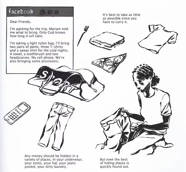
- What might it feel like to have to flee your home, your neighbourhood or your country with a moments notice? What items might you pack and why? Where might you find empathy, kindness and new opportunities?
- Watch the animation below, Dear Habib, which brings to life the challenges and opportunities, that young unaccompanied migrants face. The animation follows Habib, who journeyed to the UK from Afghanistan at just 14, and his experience of transitioning to adulthood. The animation was created by artist Majid Adin who was also a refugee.
Artist Majid Adin was forced to leave his home country, Iran, after being critical of the regime through an anonymous blog where he posted caricatures/comics. He was arrested, and spent six months in a provincial gulag. Managing to flee, he spent over a year making his way across Europe with thousands of others also escaping wars and mistreatment in their countries. He spent six month in the infamous Calais ‘Jungle’ camp, where he reconnected with art, working with the Good Chance Theatre group who supported him at this time. (Source) Below is Adin's animation and reimagining of Elton John's famous song 'Rocket Man', from the perspective of a refugee.
- Research the experiences of modern-day refugees. You can read some powerful first-hand stories here. Identify and attempt to picture - in your mind first, and then on paper - poignant scenes from these real-life struggles.
- Create a short sequence of images in a graphic novel style, or alternatively, a short animation that tells something of someone's story. Think carefully about how you might use lines, marks, colours and viewpoints/composition - and perhaps words too - to build a thought-provoking sequence. You might keep this as a series of line drawings or perhaps use cut-out paper shapes that you can move about and re-photograph.
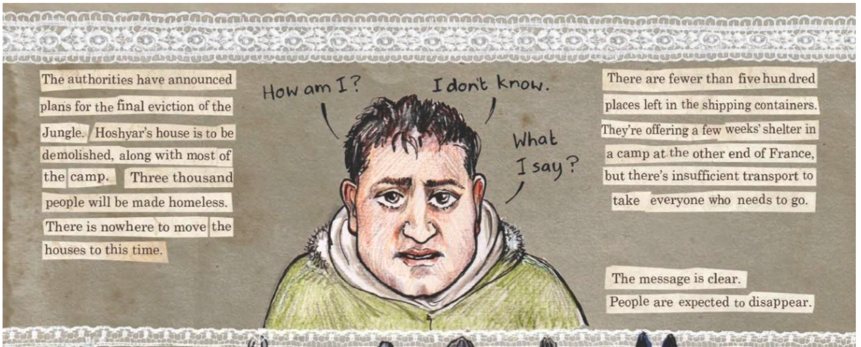
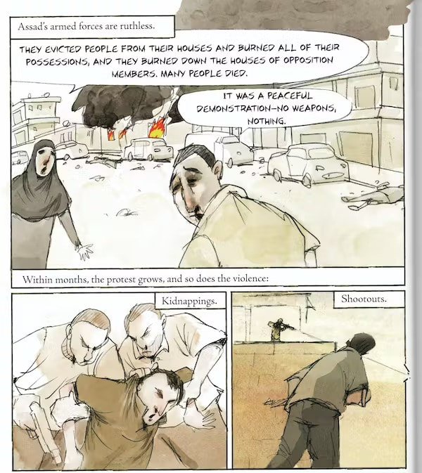
Below are a few examples from graphic novels that have shone a light on stories of refugees. Click on the images to enlarge. Consider the impact and influence of the different styles, tones and texts.
From left: Threads, by Kate Evans; An Olympic Dream -The Story of Samia Yusuf Omar, by Reinhard Kleist; The Unwanted: Stories of the Syrian Refugees,’ by Don Brown.
Taking it to the Streets
This section considers artworks/installations that might be described (or debated) as being activist works. The examples below have been installed, performed or paraded in public - with our without permission- rather than displayed in a more traditional gallery setting. Click on the images to enlarge, follow the links below to find out more.
This section considers artworks/installations that might be described (or debated) as being activist works. The examples below have been installed, performed or paraded in public - with our without permission- rather than displayed in a more traditional gallery setting. Click on the images to enlarge, follow the links below to find out more.
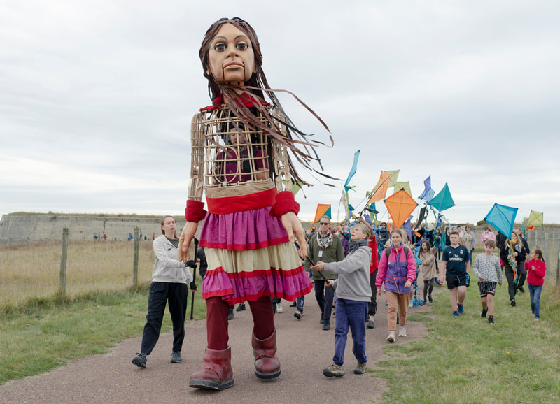
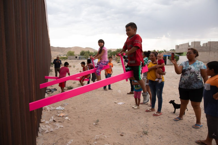
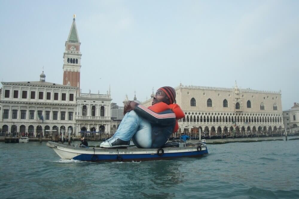
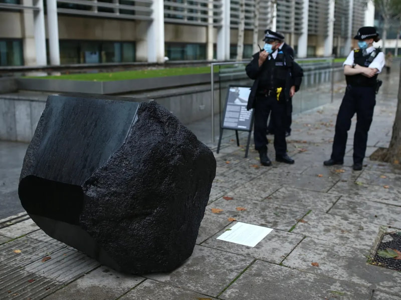
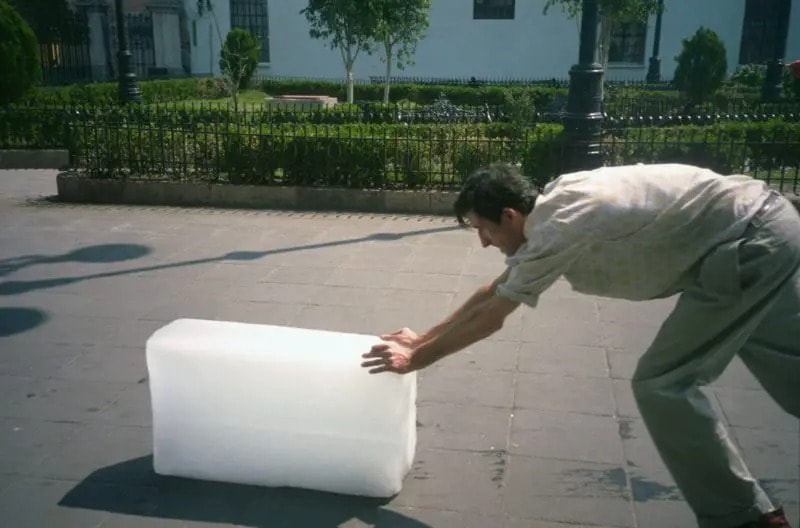
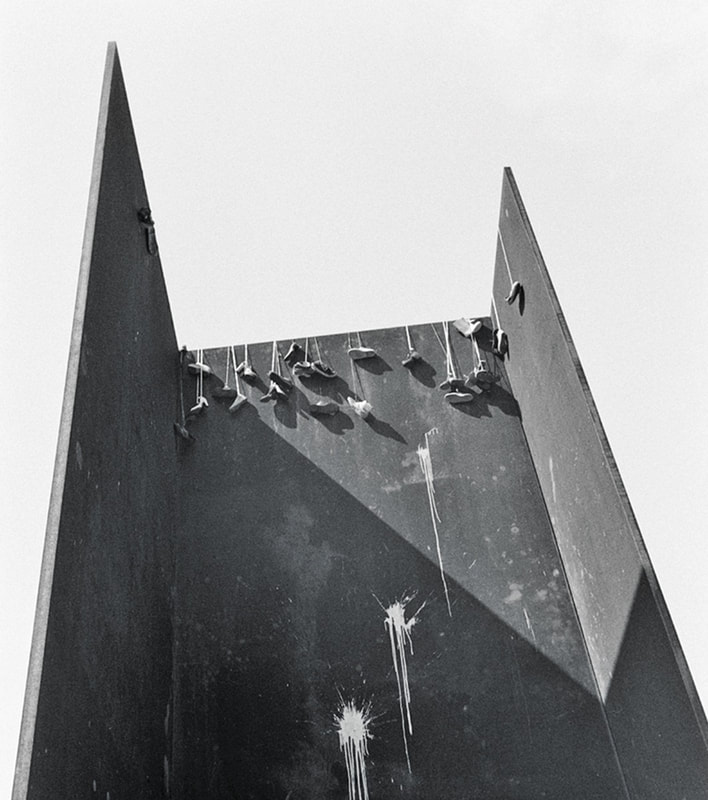
From top left: Little Amal, Handspring Puppet Company; Rael San Fratello, Teeter-Totter Wall, 2019; Schellekens & Peleman (Artist Collective), Inflatable Refugee, 2017; Fiona Banner, Klang Full-Stop, 2020; Francis Alÿs, Sometimes Making Something Leads to Nothing, 1997; David Hammons, Shoe Tree, 1980
- The examples above have been deliberately put (curated, even) into two rows of three. What distinctions or connections can you make between these combinations? Which of these artworks do you consider most accessible or appealing (visually, or otherwise)? Which are more challenging to understand or digest, and why? (Make sure to follow the individual links above to find out more).
- Is it important for an artwork to have popular or visual appeal? When it comes to issue-based work, where might issues arise with these considerations?
- Which of these works above is the most legal/illegal? To what extent might these individual works be considered ... powerful, offensive, problematic, tokenistic, unifying?
- Design an artwork to be installed, paraded or performed in a specific place to highlight an issue or injustice of your choice. Think carefully about how your response might draw attention and provoke participation and debate. You might consider a text-based response; an interactive or automated sculpture; or adapting and manipulating (appropriating) an existing structure or space.
- Produce sketches and plans of your proposal. How might you share your responses as a class group and democratically agree on the most powerful, provocative and/or effective ideas.
The sharp end of the scissors (or brush)
The following section considers a few works that might be described as social/political commentary, including collages, murals and satirical illustrations (which use humour and irony to make a point) Click on the images to enlarge, follow the links to find out more.
The following section considers a few works that might be described as social/political commentary, including collages, murals and satirical illustrations (which use humour and irony to make a point) Click on the images to enlarge, follow the links to find out more.
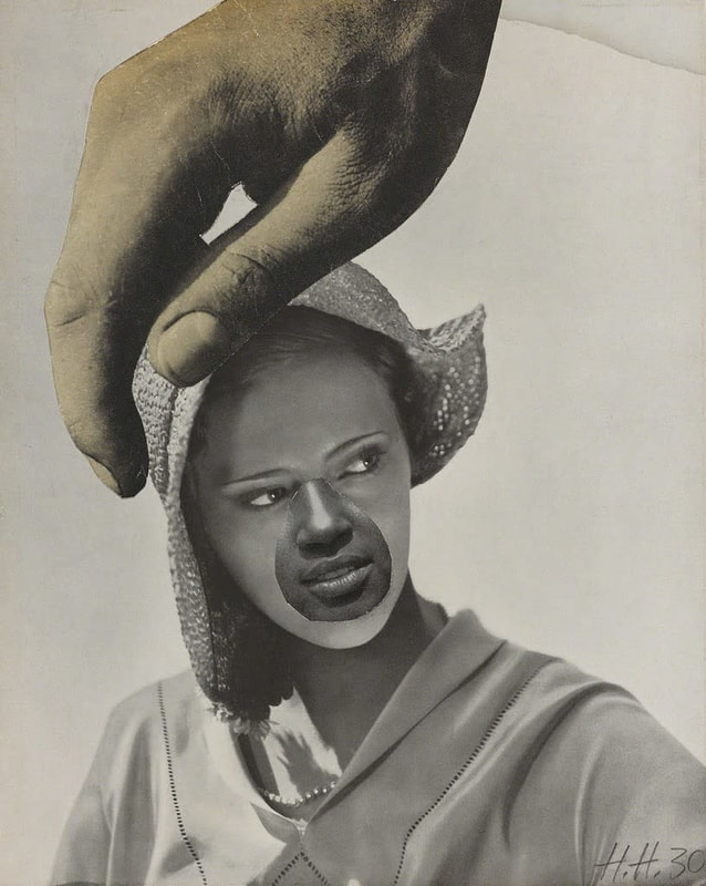
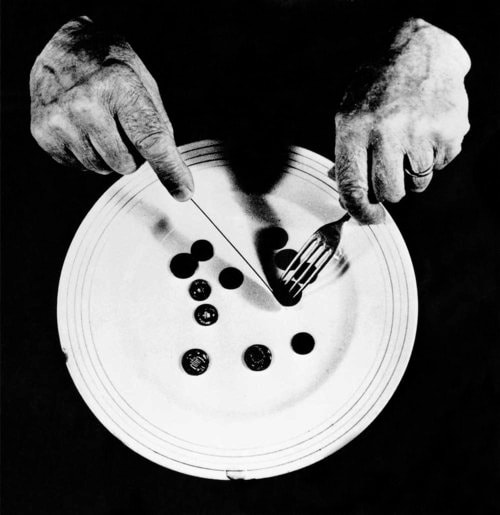
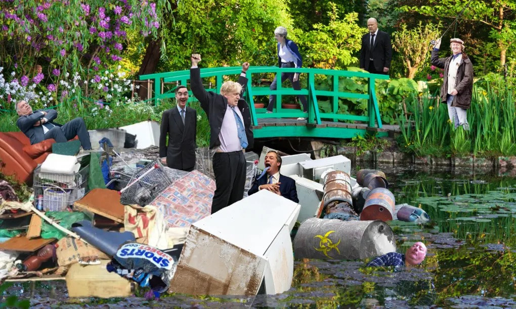
Top row: Hannah Hoch, Large Hand Over Woman's Head, 1930; Peter Kennard, Values, 1974; Christopher Spencer (Cold War Steve), Garden Bridge, 2020.
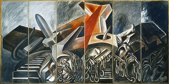
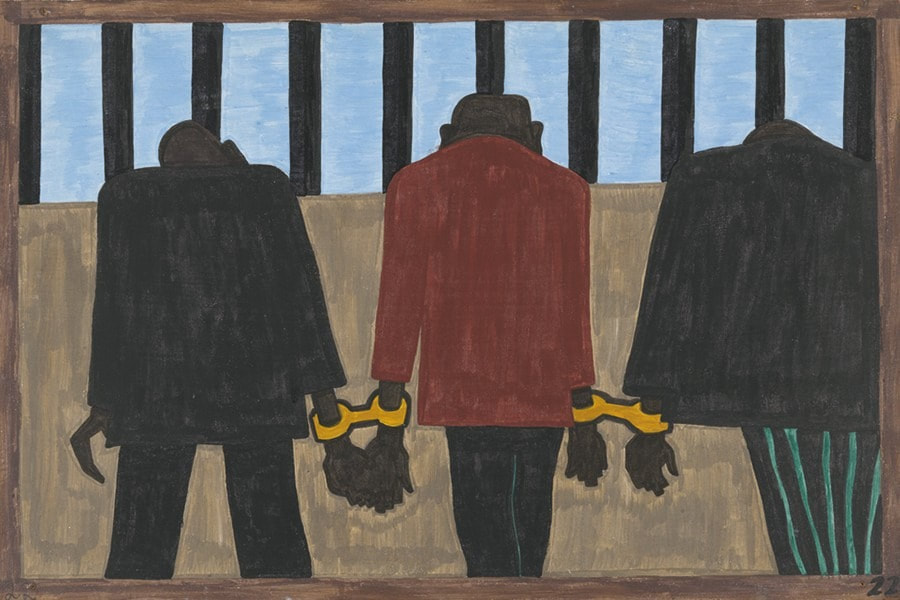
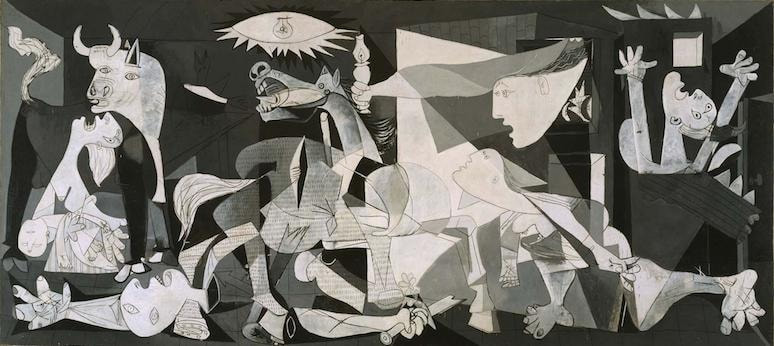
Middle row: José Clemente Orozco, Dive Bomber and Tank, 1940; Jacob Lawrence, Migration Series (22), 1940; Picasso, Guernica, 1937.
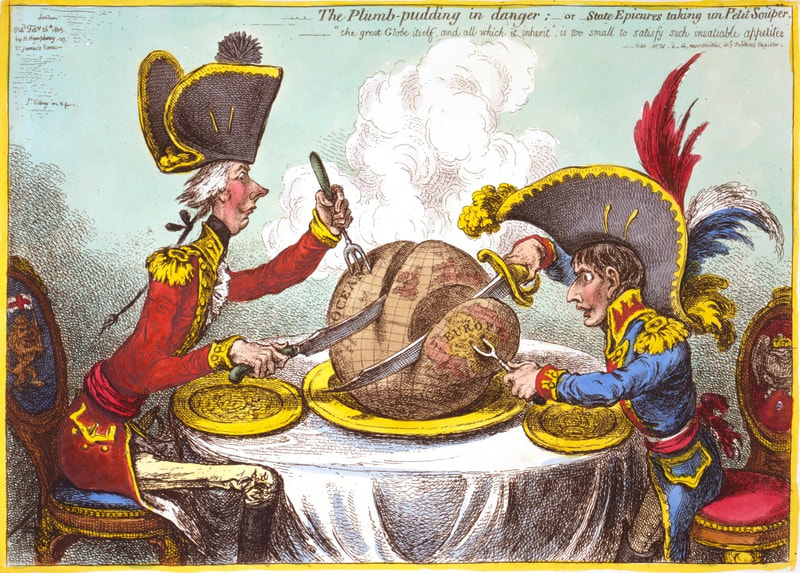
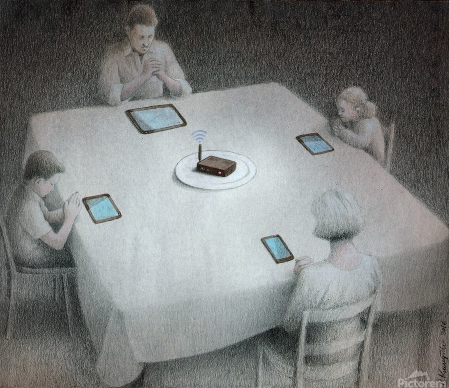
Bottom row: James Gillray, The Plumb-Pudding in Danger, 1805; Ramin Haerizadeh, Rokni Haerizadeh and Hesam Rahmanian, Where To? Wherever It Chances, 2019, Pawel Kuczynski, illustration.
The nine images above have been organised into 3 rows - collages, painted murals and illustrations. Well, sort of. The boundaries between techniques, genres, intentions ... can be blurred. It's not always easy (or even necessary) to group artworks together. In addition, how, where and when an artwork is encountered will also influence any understanding of it.
Once you have researched the images wider, perhaps focusing more in depth on one or two, have a go at one or more of the following related tasks:
- Is it possible to identify the issues and themes that these works address without reading wider? Make notes of your initial thoughts. You might also use sketches to draw attention to particular details. Who do you think the work is intended for, and where do you think it might have originally been shared or shown? How are your first impressions altered with wider research and reading via the links above?
- Is it possible for an image to affect how you feel or think? If so, which ones do this most effectively, and why?
- Which image might you describe as ... powerful; humorous; surreal; clever; expressive; skilful; radical; frightening; confusing? What other words come to mind for each image. Try to write down at least 3 descriptive words for each one.
Once you have researched the images wider, perhaps focusing more in depth on one or two, have a go at one or more of the following related tasks:
|
|
|
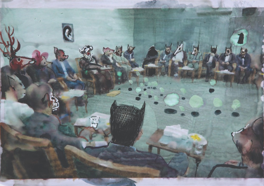
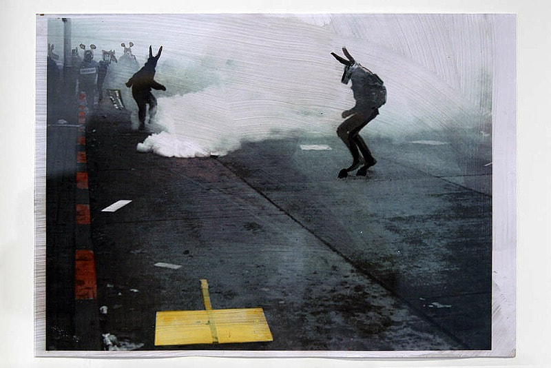
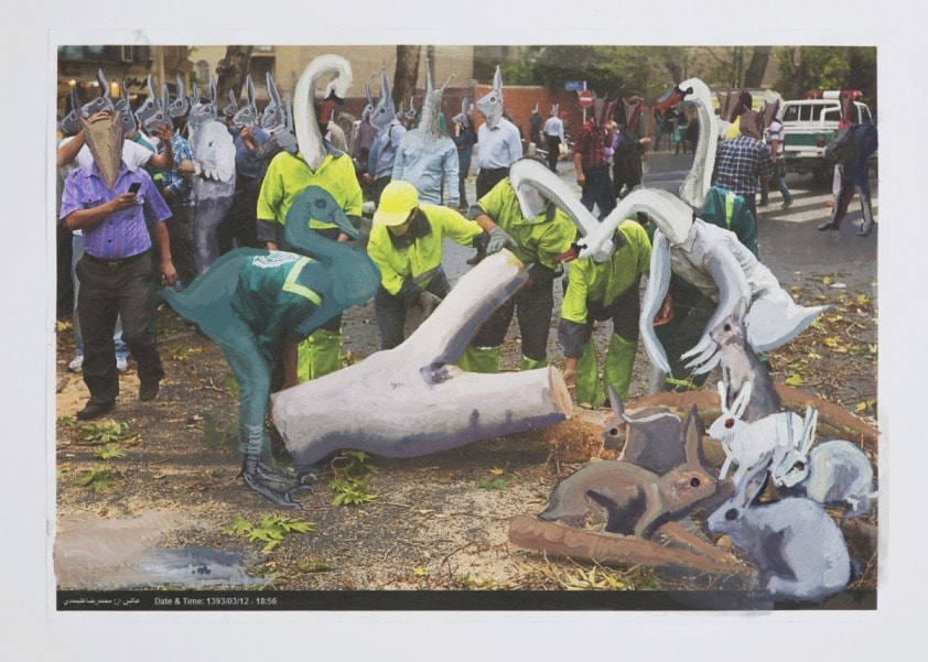
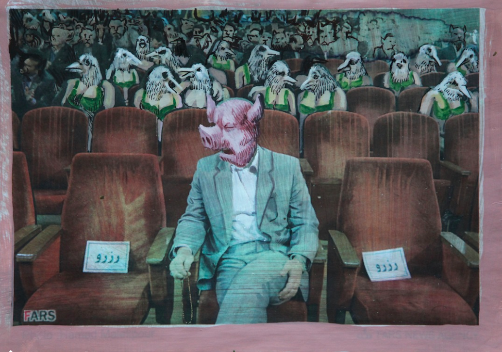
Rokni Haerizadeh is an Iranian artist, born in Tehran shortly before the start of the Iran-Iraq War. Haerizadeh's early experiences and questions about art were directly impacted by the war. In his on-going project, Fictionville (examples above) Haerizadeh paints directly onto news photographs or stills taken from news footage. These works attempt to show how the media equates violence and popular protest with entertainment and the characters contained in these stills are transformed into human-animal hybrids and clownish figures.
|
|
|
|
Picasso documented the effects of the Spanish Civil War in his painting 'Guernica' in 1937. This artwork also uses powerful symbolism to evoke the horror, trauma and impact - physical and psychological - of conflict.
|
An artwork unable to make people feel uncomfortable or to feel different is not one worth creating. This is the difference between the artist and the fool. AI WEIWEI
FURTHER READING
- The Terrifying Cynicism of Teeter-Totter Wall Art in America article
- Dear Habib Positive Negative article
- Comics and graphic novels examining refugee experiences The Conversation

