TC#2: MAKING SENSE (EXPRESSIVE APPROACHES - COLOUR & MIXED MEDIA)
|
ABOUTThis resource has been designed for KS3 teachers and students (Term 2) and links closely with Threshold Concept 2: Art communicates, in every sense.
KEY THEMES
|
IN PICTURES
The images below have been chosen to encourage initial reflection. Consider them carefully and complete the following activities. Click to enlarge. Roll over the images to reveal the titles and artist names.


IN DISCUSSION
ACTIVITIES
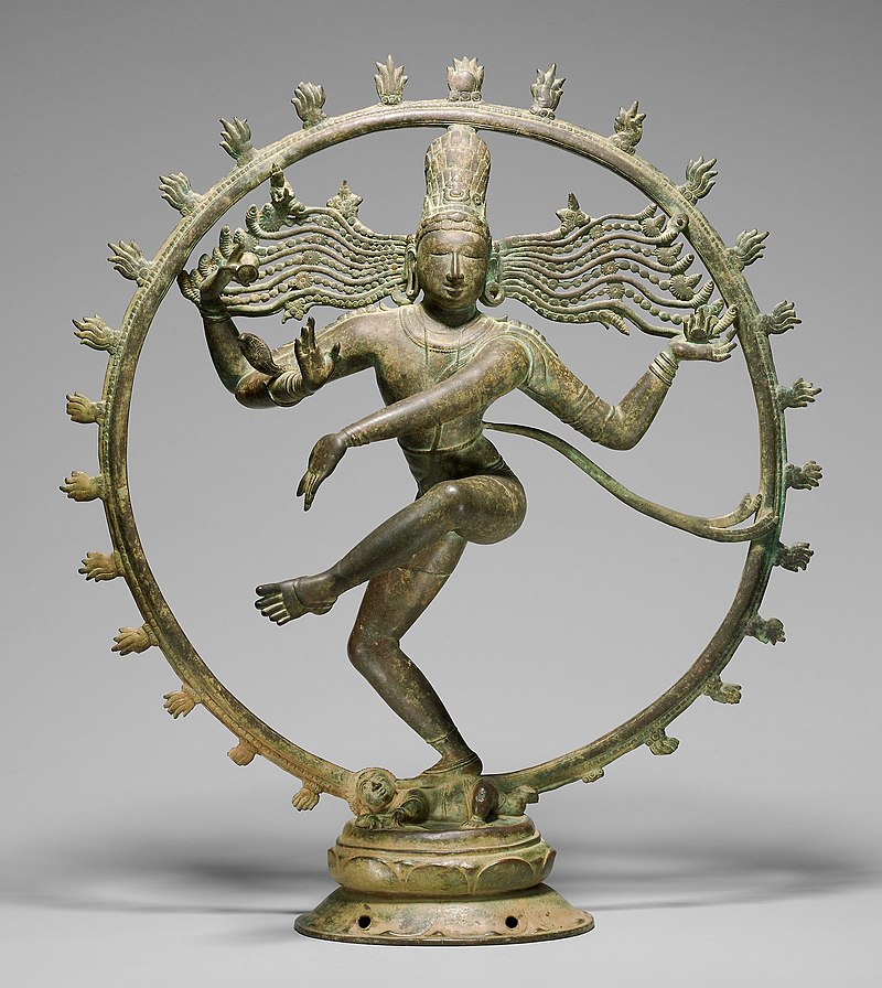
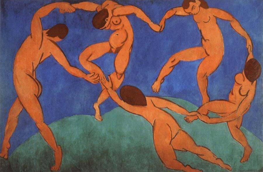
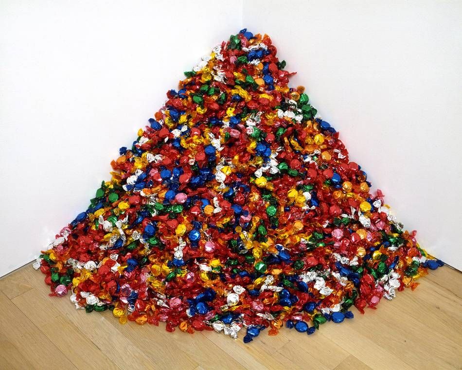
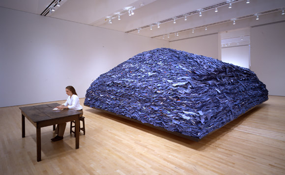
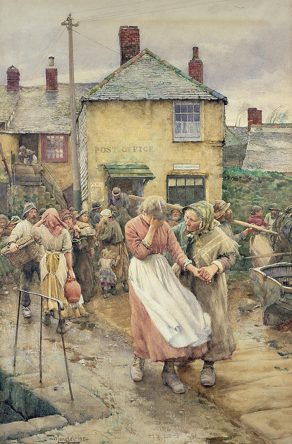
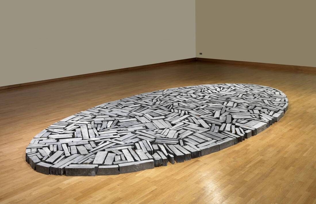
In addition, the artworks above have been playfully grouped in these particular rows. These could be titled: 'Dance', 'Location', 'Memories', and 'Sensations'. Which words best suit which rows? Research the artists and titles of the works to help further with this.
ADDITIONAL QUESTIONS
- On an A4 page, draw a similar (but empty) grid of 12 squares. Now add two descriptive words for each work in its relevant box. Which words are most obvious or helpful to do this? Do you think of materials or techniques (e.g. a painting, a sculpture...) or describe the subject matter (e.g. contains some people, a pile of objects, abstract marks...), or something else, such as describing a mood, feeling, or its colours? Remember: these are all photographs of artworks rather than the original works. How might this limit our experience of them?
- Hover over the works to reveal the titles and names. Choose 3 artworks to research in more depth AND within the relevant squares on your grid, add 3 interesting facts/insights about these particular artworks.
- Can you create your own visual code to connect these 12 artworks in your grid? For example, add a red dot to each square that is a painting; add a grey rectangle to each square that is a sculpture; add a blue scribble to each work that might be an installation. How else might you group these works, for example:
- FLAT or 3 DIMENSIONAL
- PAINTINGS, SCULPTURES or INSTALLATIONS
- TRADITIONAL, MODERN or CONTEMPORARY
- ARTWORK TO LOOK AT; ARTWORK TO WALK AROUND; ARTWORK TO TOUCH, TASTE OR SMELL.
In addition, the artworks above have been playfully grouped in these particular rows. These could be titled: 'Dance', 'Location', 'Memories', and 'Sensations'. Which words best suit which rows? Research the artists and titles of the works to help further with this.
ADDITIONAL QUESTIONS
- Which artwork affects you the most - make you think, question, act, feel ... (be it happy, curious, angry, inspired...)? How might this happen, and do you think others would feel the same?
- Is it easy (or possible) to describe how an artwork makes you think, feel or act? What role does the colour of the works play in this?
IN words
The following words might prove particularly beneficial to this project:
- Visual elements: colour, line (flow, weight), tone (light and dark), texture (surface), shape (flat, 2 dimensional), form (3 dimensional), pattern.
- Colour: warm, cool, secondary, tertiary, complementary, contrasting;
- Composition, sensation, expression, expressionism, abstraction, installation, gestural, visceral, emotion, intuition.
In THE ARTROOM
The following slideshow supports the potential sequence of lessons/activities set out below:
1. Making sense of art
|
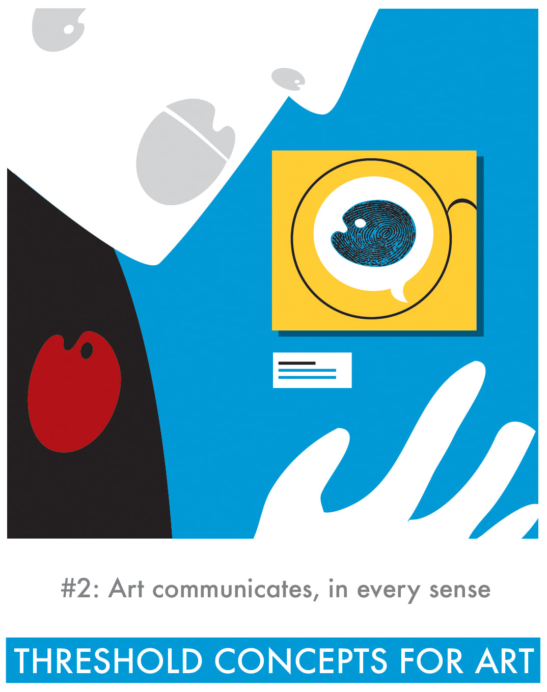
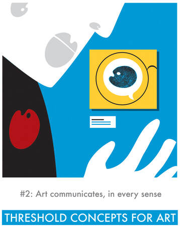
Look carefully at The Threshold Concept 2 illustration. How does this suggest various senses engaging with an artwork?
Create your own alternative illustration/artwork for this Threhold Concept 2: Art communicates, in every sense. You might wish to use one of the following alternative approaches:
|
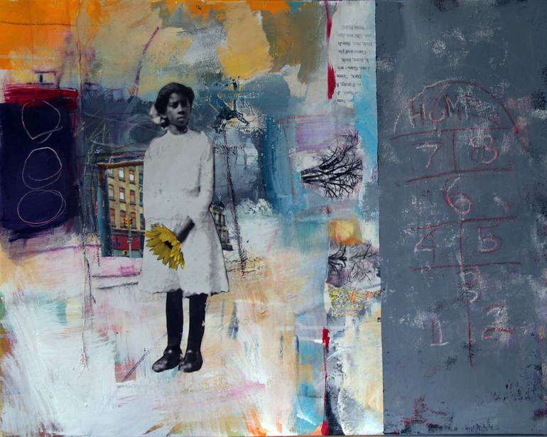
2. Collaged Memories
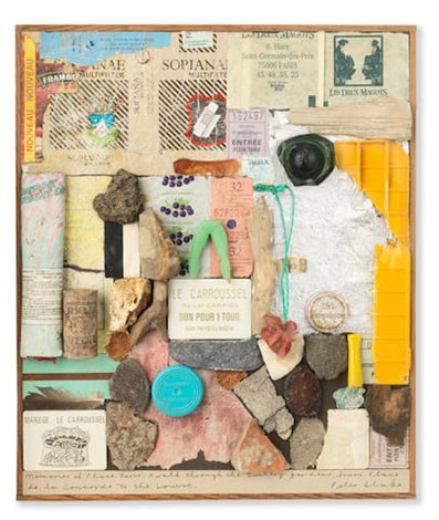

Left to right: Peter Blake , Memories of Place, Paris, 2005; Karen Powell, Wanna Play?, 2019; Henry Ward, Kitchen table sculpture
Consider the images above. See slide 3 of the slideshow for further information. These works combine, collage or assemble elements. Develop an experiment in response to a memory or personal experience. Choose one of the following approaches:
- Create a mini sculpture. This doesn't have to be representational or recognisable as something. It might be abstract - interesting in its own right through your combinations of shape, colour, surfaces etc. This mini sculpture might be made from old/everyday objects such as those found in a 'bits and bobs' drawer at home, or it might use old toys (or bits of old toys). Alternatively you might make this from collected objects/fragments such as those found in a garden or garden shed.
- Create a collage/mixed media work in response to a personal memory (or combination of memories). This might be a recent experience, or something powerful, entertaining or absurd from years ago. Combine (copies of) photographs and pictures with marks, colours and textures from a variety of media - pencils, paint, torn paper, fabric. Be experimental and trust your intuition - aim for an interesting and layered response rather than one that is overly-precious or cautious.
3. Drawing on (and from) memories
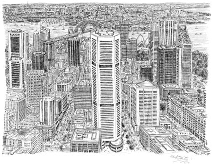
Consider the images above by Stephen Wiltshire and Emma Kay (slide 4 in the presentation). These works are very different in terms of their artist intentions and approaches. But there are also visual similarities. Significantly, both works have been created from memory. Use the links to find out more - this will certainly inspire you for the the following task, based on Kim's Game. This is a traditional memory game where a range of objects (10 - 15 small items) are arranged on a tray and covered up, to be revealed only for a short while (e.g. 30 seconds). Observers then have to try to remember and list all the items.
How might this game be adapted to using artworks? - for example, look at an artwork for a limited period of time and then attempt to sketch from memory what has been seen. You might search the Tate Collection to generate a random work for this - try searching 'memory' for example.
- With a partner or in a small group, play 'Kim's Game'. Take it in turns to prepare a concealed tray of objects. Rather than writing down the names of the objects on the tray, observers should attempt to sketch these from memory. You might draw in an experimental way, also considering how they have been arranged. Decide if you are aiming for realistic depiction (such as demonstrated by Stephen Wiltshire), or something more playful, (such as the text-based approach of Emma Kay).
How might this game be adapted to using artworks? - for example, look at an artwork for a limited period of time and then attempt to sketch from memory what has been seen. You might search the Tate Collection to generate a random work for this - try searching 'memory' for example.
4. Expressing (and expressive) memories
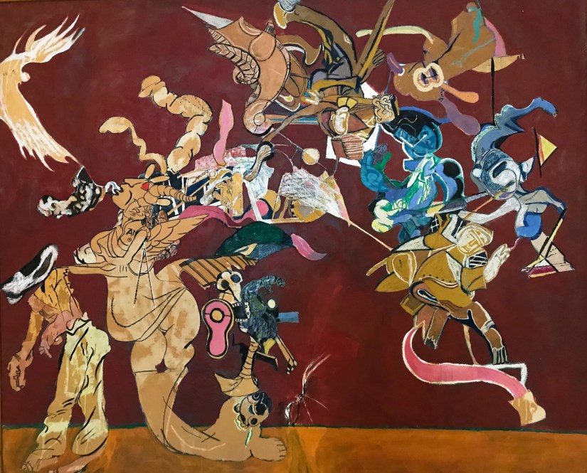
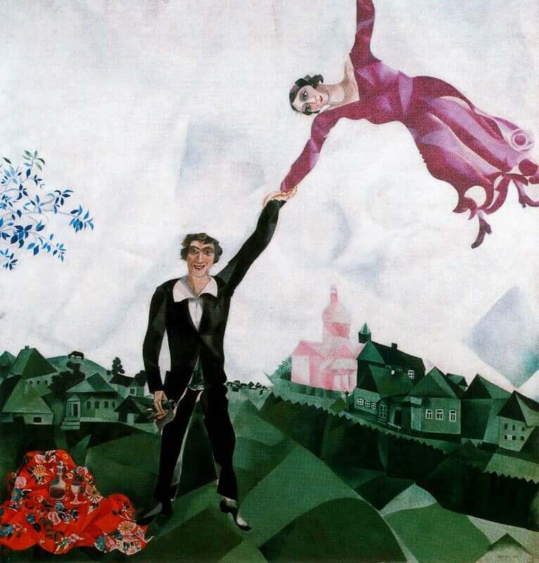
The two artworks, above (and on slide 5 of the presentation) might be described as dreamlike, surreal, expressive or abstracted. Follow the links to find out more. These are works by two different artists, in very different times and places. However, both works are the result of a combination of personal memories and imaginings. The colours also seem to be significant in how they resonate and energise the works.
- Plan, design and produce your own experimental artwork in response to a memory, dream or hope. Begin by imagining you are in that particular time and place; make creative notes for each of your senses and more - for what you (imagine you) see and hear, taste, smell, touch and feel. Think carefully about the colours you want to use and why. Do not feel the work has to be easily recognisable. You might use paint or collage or something more experimental, such as sound recordings or performance.
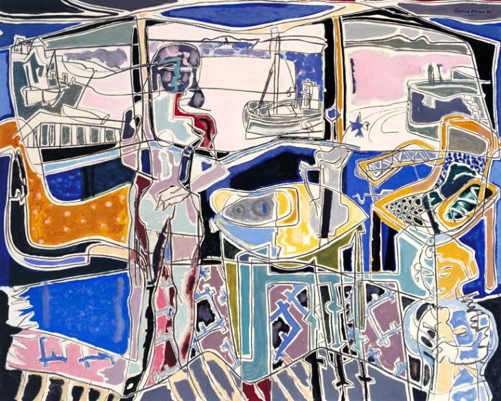
5. Conversations between artworks
The two works, above, are discussed within the slideshow (slides 6-8). The exercise on the slideshow draws attention to how artworks can 'communicate' with one another - how connections and common themes can arise when an artwork is placed alongside another.
- Produce an experimental artwork to be added to these two images to form a triptych - a 3-panelled artwork. This new work might be placed between them to complete a sequence or 'bridge' a gap. Alternatively, your response might be more disruptive - it might alter the whole feeling or impact of the works when combined. You might use drawing, painting, collage or an alternative approach such as sculpture, photography or film.
6. Compositions with (and about) colour (and sound).


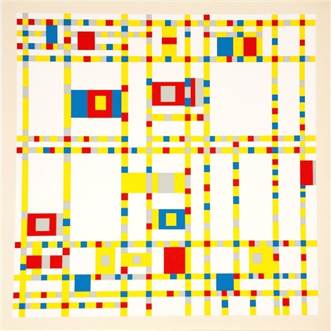
Clockwise from top left: Lubaina Himid, Naming the Money, 2004; Stuart Davis, The Mellow Pad, 1945-51; Wassily Kandinsky, Composition VIII, 1923; Piet Mondrian, Broadway Boogie Woogie, 1942-43
The 4 works above are introduced within the slideshow (slides 10-13). These works might all initially be described as 'colourful'. However, words such as 'energetic', 'lively' or even 'musical' might also be appropriate.
|
|
Lubaina Himid and her work is distinct from the others for a number of reasons:
|
- Produce a range of abstract experiments exploring colour and mark making. Think carefully about the shapes, marks and colour combinations that you choose. These might be made with oil pastels, coloured pencils or paint, or collaged with coloured paper or photographs/colours cut from magazines. You might use a combination of these materials. To help you further you might choose one of the following starting points:
- A response to listening to a favourite song, or a range of different types of music.
- A response to your own cultural experiences, heritage and inheritances - the colours of your skin, eyes, hair; the places you have visited or lived; the sounds, smells, tastes or textures that remind you of home or a particular place of importance.
Colour provokes a psychic vibration, colour hides a power, unknown but real, which acts on every part of the human body Wassily Kandinsky
7. Colour
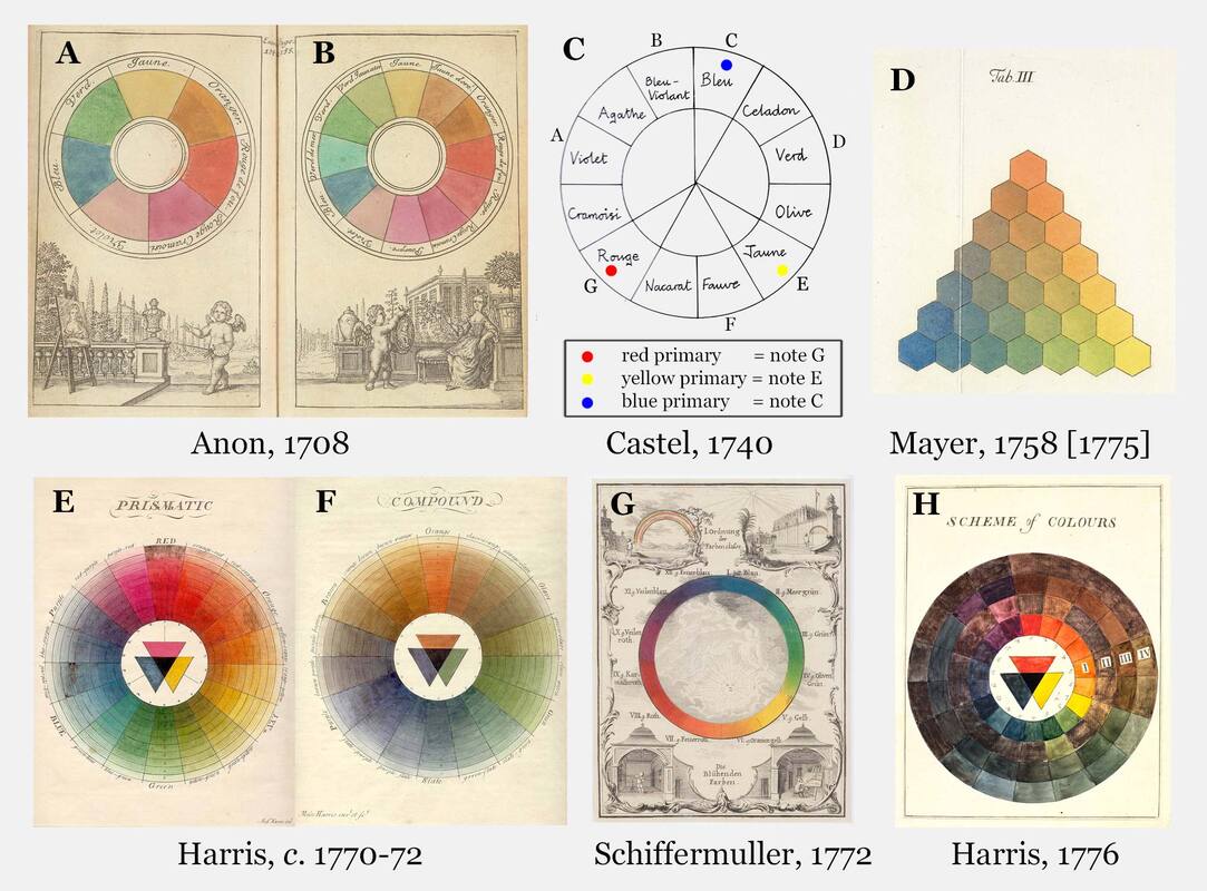


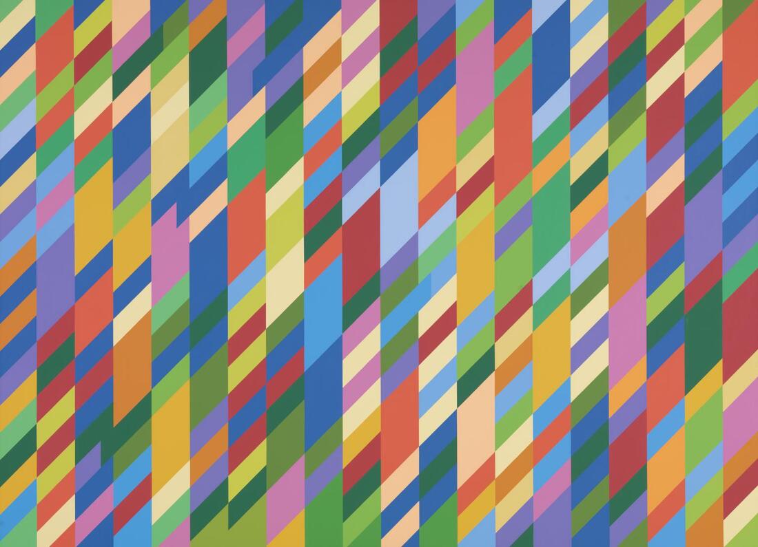
Examples of various colour wheels and theories
The images above show a variety of colour wheels and theories. For this section, prior to completing the activities below, scroll up and revisit the slideshow, slides 15-18.
|
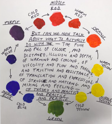
At Primary School, we tend to learn about Primary and Secondary colours. In Secondary school, most students encounter colour theories within Science and Art. These tend to introduce Additive Theory (using light) and Subtractive Theory (using pigments, usually paint). This can be confusing. Colour terms such as RGB (Red, Green, Blue) or CMYK (Cyan, Magenta, Yellow, Black) might also be familiar due to printer or computer settings.
In the art department we tend to introduce concepts of 'warm' and 'cold' colours within ‘dual primary’ colour wheel. This can help us to look more sensitively at colours and also improve our abilities to mix and compose with colour.
|
Expressing a sense of place (with colour and marks)
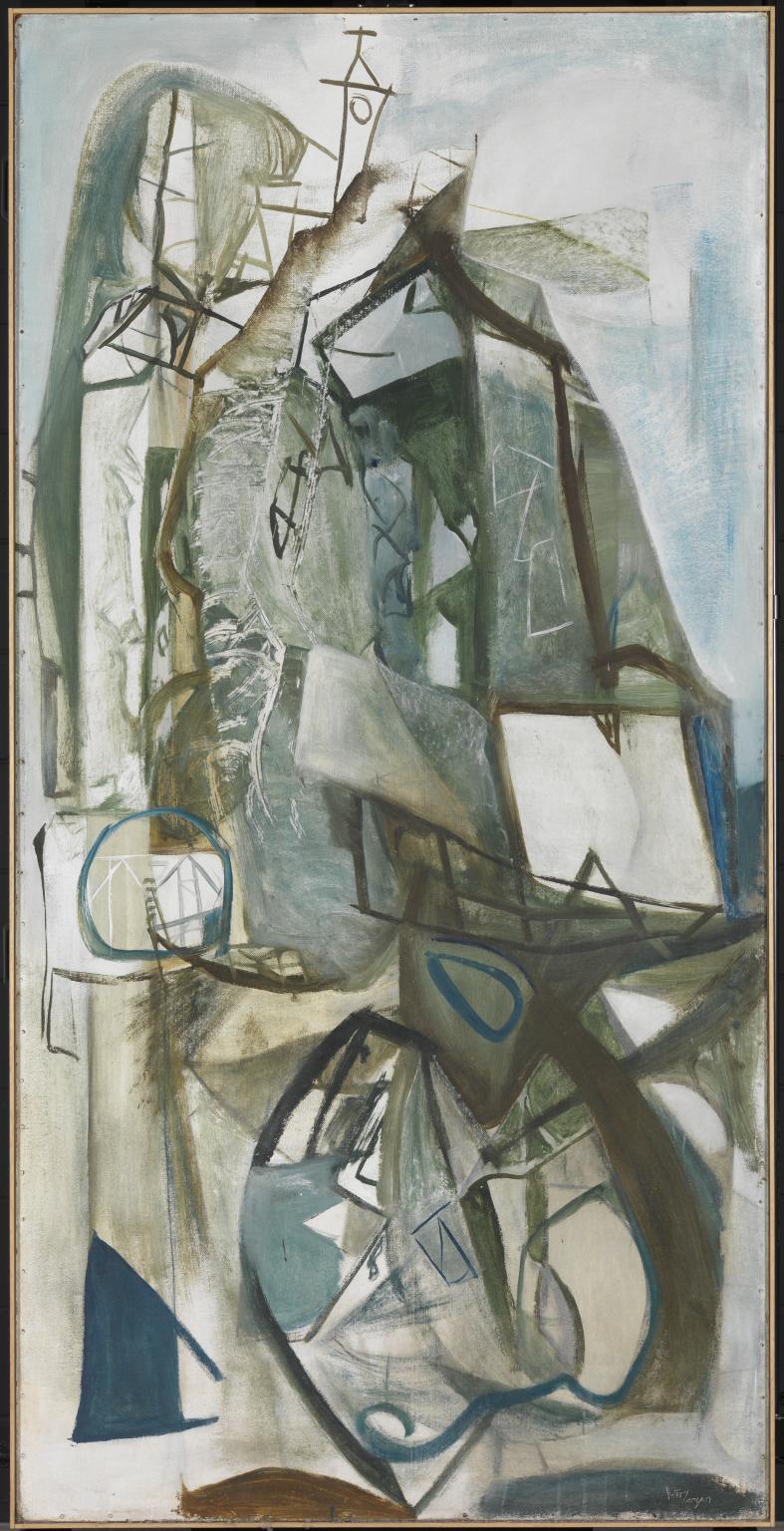
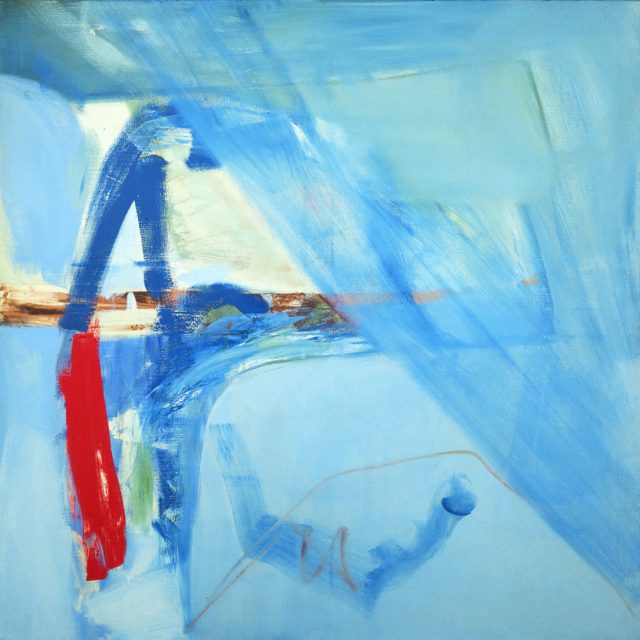
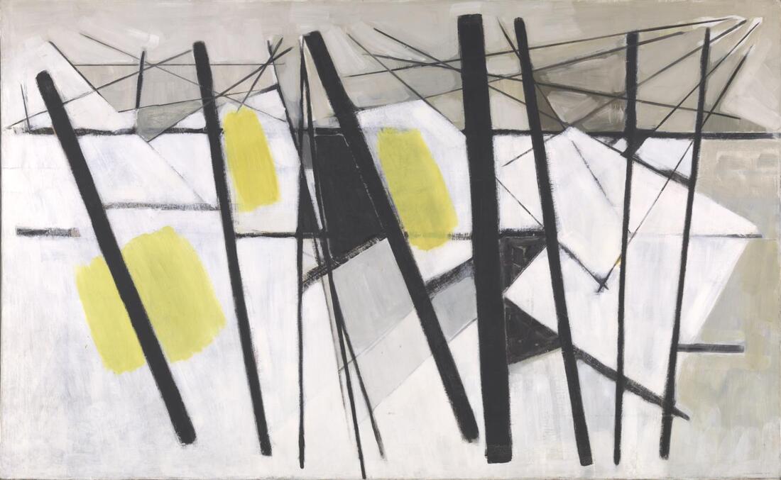
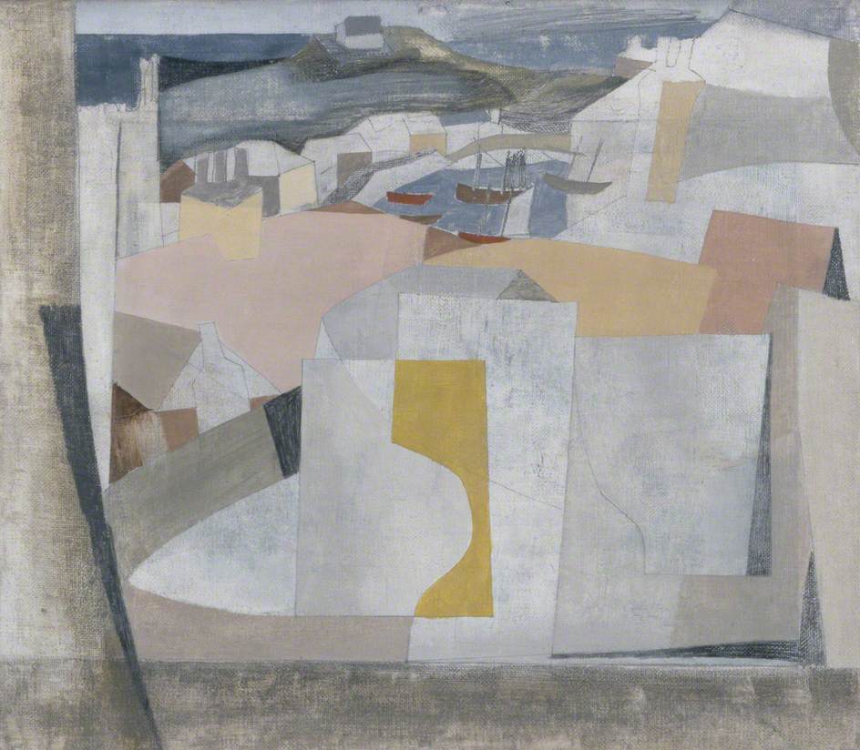
Click on the images above to view enlarged. Left to right: Peter Lanyon, Porthleven, 1951, and Soaring Flight, 1960; Wilhelmina Barns-Graham, White, Black and Yellow (Composition February), 1957; Patrick Heron, Harbour Window with Two Figures : St Ives : July 1950; Ben Nicholson, View of St Ives Harbour, 1949; Terry Frost, Lilac and Yellow, 1967
Click on the images above to view these artworks enlarged. BUT remember: these are photographs of paintings. In real life they are much bigger and more textured, and that influences our experience of them and how they affect us. Consider the implications, benefits and challenges for painters working on a much larger scale, the size of a table tennis table, for example? What of the practicalities, such as costs and space, alongside the physicality of working at a larger scale - arm movements etc.
- How might you experiment with working on a larger scale, exploring making marks or combining colours through confident movements and gestures? If space or art materials are limited, what other imaginative (or temporary) possibilities might there be - for example, mark making in sand on the beach; working with water on a garden fence; arranging objects, clothes, fabrics across a floor space; drawing with light in the dark and recording this via a camera with a slow shutter speed?
- Thinking carefully about combinations of colours and marks - and how you might communicate a sense of place, or your feelings of it...Develop your own personal response to your local area or home environment. This might involve:
- Imagining an aerial view above your room, house, garden or local area. You could use Google Maps or Streetview as inspiration for shapes, marks and colours.
- Taking a walk and gathering a series of photographs or sketches as inspiration or reference, and then attempting to document a journey through your work - this might be as a series of images, or a singular response. You might also record sounds or collect natural forms or discarded objects along the way.
- Drawing, painting or collaging - and/or abstracting, imagining and exaggerating colours, shapes, marks- in a way that might express or emphasise your feelings of a place.
- Imagining a particular season, associated smells, tastes, textures or sounds, and exploring ways of representing, suggesting or illustrating these.