|
“In the town itself, actually within sight of the house in which Charlie lived, there was an ENORMOUS CHOCOLATE FACTORY! Just imagine that! And it wasn't simply an ordinary enormous chocolate factory, either. It was the largest and most famous in the whole world!” Roald DAHL, CHARLIE AND THE CHOCOLATE FACTORY
IN PICTURES
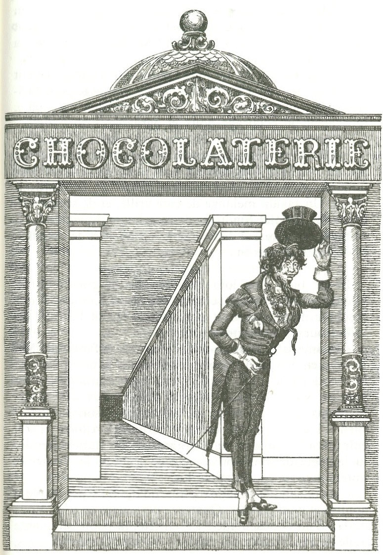
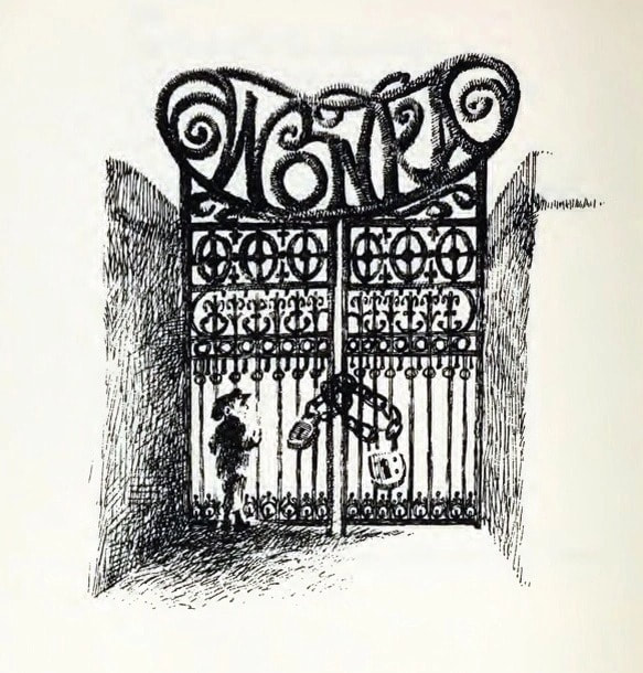
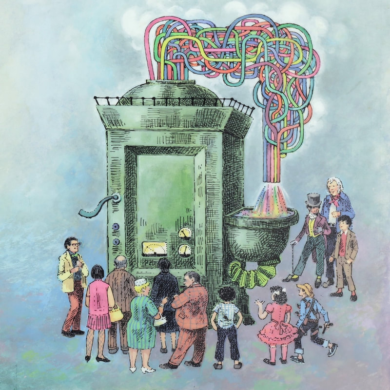
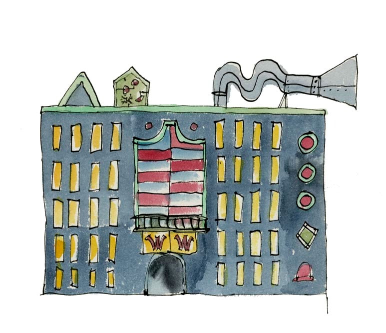
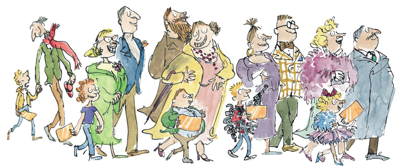
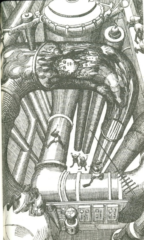
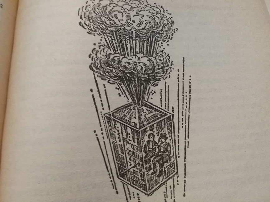
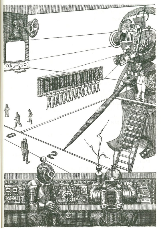
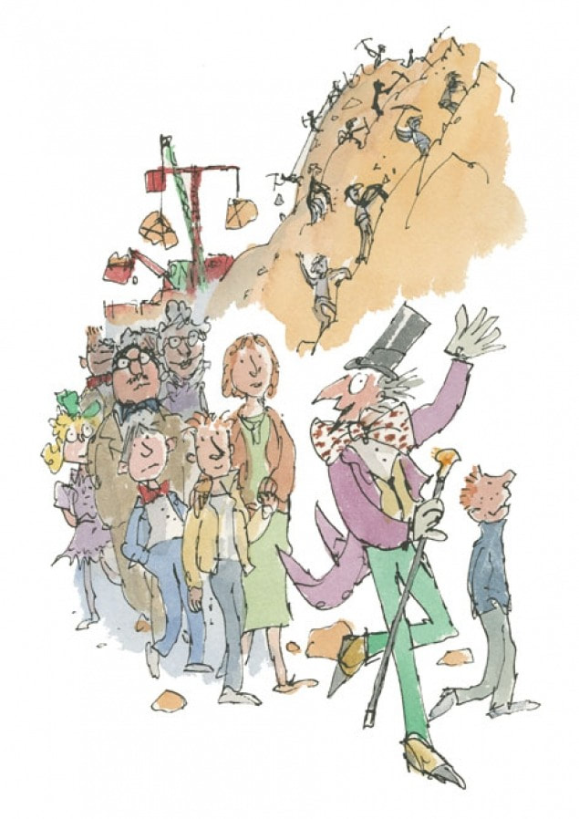
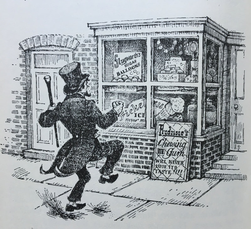
Illustrations for Charlie and the Chocolate Factory by Michel Simeon, Joseph Schindelman, Faith Jaques and Quentin Blake.
Charlie and the Chocolate Factory by Roald Dahl is an iconic book. It has been illustrated by many different artists since publication in 1964.
One of the challenges for illustrators of this book is that it contains multiple figures in busy scenes and built-up locations. This links with what follows ...
- Look carefully at each of these illustrations. How would you describe the differences in styles and techniques?
- How do these different compositions and styles influence our impressions of the chocolate factory?
- What creative and practical decisions do you think an artist makes when planning illustrations such as these?
- Do you think these artists worked from real life or from their imaginations, or a combination of both?
- Read the quote above the images. This emphasises the enormousness of the chocolate factory. (How) do these illustrations show a sense of scale?
- On an A5 page, using an ink pen and line only (no tone/shading): produce an imaginative illustration of the front of a chocolate factory. You might use Quentin Blake's illustration as a starting point and then develop this further by adding new details. Alternatively, you might invent a very different building! Try to use a quick and confident flowing line. Do not worry about making mistakes. Once complete, to provide a sense of scale, add some additional details alongside your factory, for example a figure (or two), a tree, a car or a cat ... The smaller you draw these, the more gigantic your factory will appear.
One of the challenges for illustrators of this book is that it contains multiple figures in busy scenes and built-up locations. This links with what follows ...
People and places - THE WORK OF L.S. Lowry
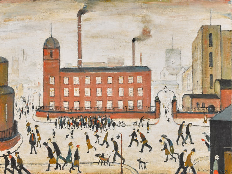
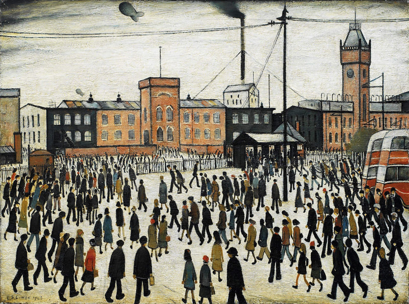
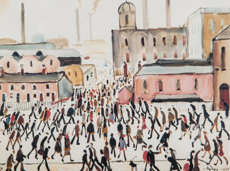
Laurence Stephen Lowry was an English artist, born in 1887. He is famous for painting scenes of life in the industrial districts of North West England in the mid-20th century. Lowry developed a distinctive style of painting human figures, often referred to as "matchstick men". Although he liked to say he painted only what he saw, he composed his paintings in his studio, working from memory, sketches, and imagination.
Lowry's use of simplified figures with no shadows led critics call him a naive painter. The word 'naive' means showing a lack of experience, wisdom, or judgement. However, in art this term can refer to artists that have not had a formal art education, or may deliberately choose to work in simplified ways. For the record, Lowry did take evening classes at Manchester School of Art. He was a well-known and successful artist towards the end of his lifetime.
ACTIVITY
Lowry's use of simplified figures with no shadows led critics call him a naive painter. The word 'naive' means showing a lack of experience, wisdom, or judgement. However, in art this term can refer to artists that have not had a formal art education, or may deliberately choose to work in simplified ways. For the record, Lowry did take evening classes at Manchester School of Art. He was a well-known and successful artist towards the end of his lifetime.
- Look carefully at the examples by L.S. Lowry. What words help to describe the atmosphere of these paintings? How is this achieved?
- Do you think the description 'matchstick men' is fair or accurate?
- Why do you think some critics described his work as naive?
- Do you think L.s. Lowry worked from real life by watching and painting these scenes in the streets, or did he work from his imagination?
ACTIVITY
- Choose a painting by L.S. Lowry to analyse and research in greater depth. You can do this by making notes, sketching sections and/or experimenting with similar techniques. For context, you might find out the title, date and size of the work; where, how or why it was made; maybe even where it is now. For visual analysis, you might consider its composition - how the scene has been selected, arranged and 'framed'. You may also think about the colours, lines and shapes. For example, how these influence where the viewer looks and consequently 'reads' the imagery. Alternatively, you might focus on the mood, feelings or memories that the painting evokes in you. How might you describe these experiences in an imaginative way? For example, by writing a short imaginative story or poem.
Naive Art?
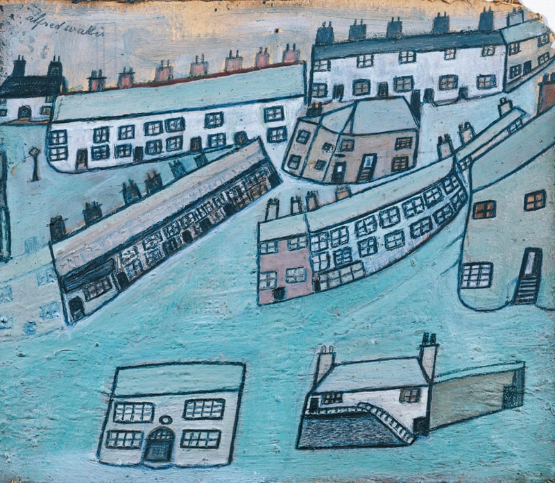
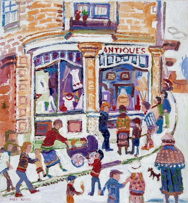
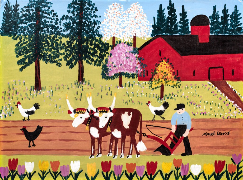
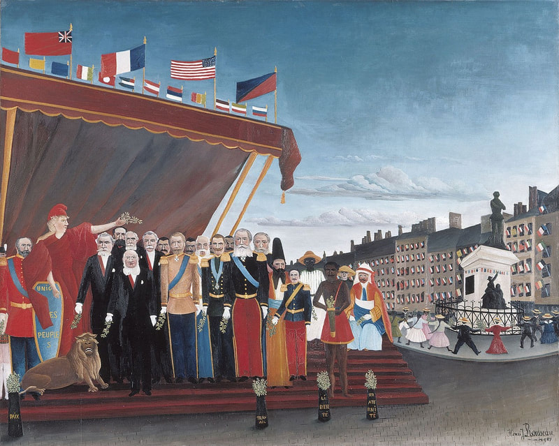
Let's look at some other artists whose work has been described as Naive Art. 'Naive Art' is used to describe art that is simple, unaffected and unsophisticated. It usually refers to art made by artists who have had no formal art training. The examples below, from top left, are by Alfred Wallis, Fred Yates, Maud Lewis and Henri Rousseau. Of these four, Fred Yates was the only one to study art. (He studied in Bournemouth). Fred Yates was very influenced by Lowry and this can be seen in his similar use of figures. These are often in side profile with no shadow and have a strong sense of movement.
- Which words help to describe the similarities and differences in these four examples? Here are a few to choose from: outlined, textured, flat, layered; simplified, imagined, accurate, formal, wonky, controlled, expressive, organised, disorganised; bright, muted, contrasting, balanced.
- Which example do you prefer most, and why?
- Which example do you consider most accurate or realistic? Which is most ... expressive, energetic, upbeat, sad, atmospheric, familiar?
- What makes an artwork more or less successful, and who decides this?
Produce a drawing or painting of a busy scene inspired by the 'naive' styles above. You might choose a familiar location - for example, the town centre on a Saturday afternoon, the beach on a summer day, or the school playground or dining room at lunch time. If possible, you might use some photographs or research some images to help with this. Importantly, do not overly worry about accuracy or perspective - the illusion of depth. Instead, consider some of these prompts:
- How might you enjoy giving each member of a crowd a unique appearance and identity, for example, through their clothes, body shapes, colours or actions?
- How might you create a sense of movement and bustle amongst a group of figures?
- How might you experiment with scale, proportions or perspective? For example, you might draw attention to certain characters or buildings by painting these larger than their surroundings.
Naive Art can be very appealing because of it's (sometimes) child-like, direct and unpretentious style. Often, Naive Art can appear simplified, flat or even distorted because there is no formal use of perspective. Keep this in mind as you look at the examples in the next section.
A sense of perspective
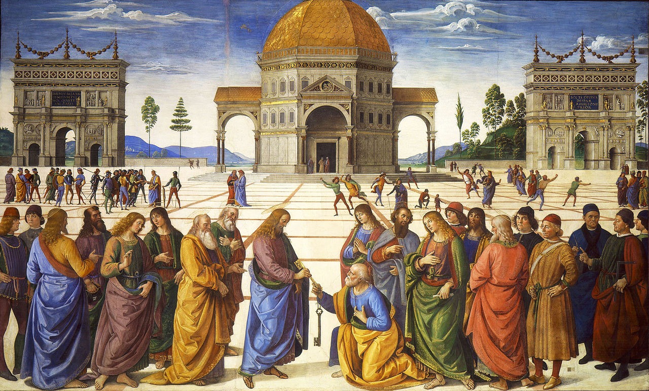
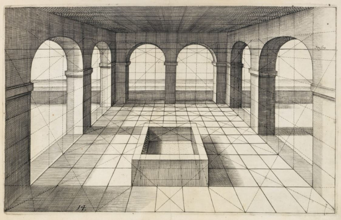
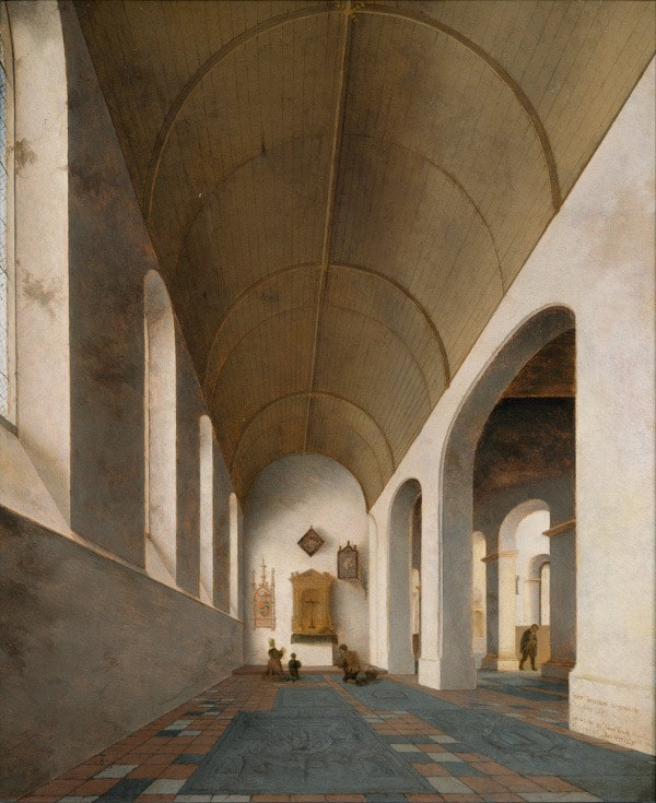
From left to right: Pietro Perugino's Delivery of the Keys (1482); a 15th Century Dutch print demonstrating perspective; Pieter Saenredam, 1645
|
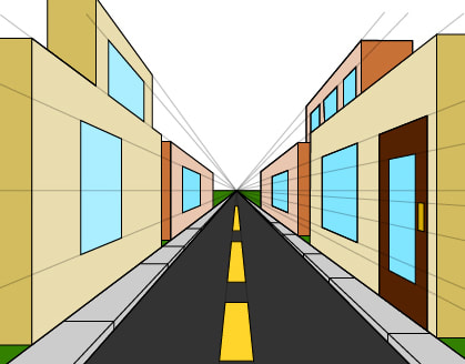
Perspective is a method for drawing upon a flat surface to make the subject/imagery look three-dimensional. With perspective, things appear to get smaller as they get further away. The examples above show early experiments with one-point perspective. This is where lines meet at a single 'vanishing point' on the horizon line.
|
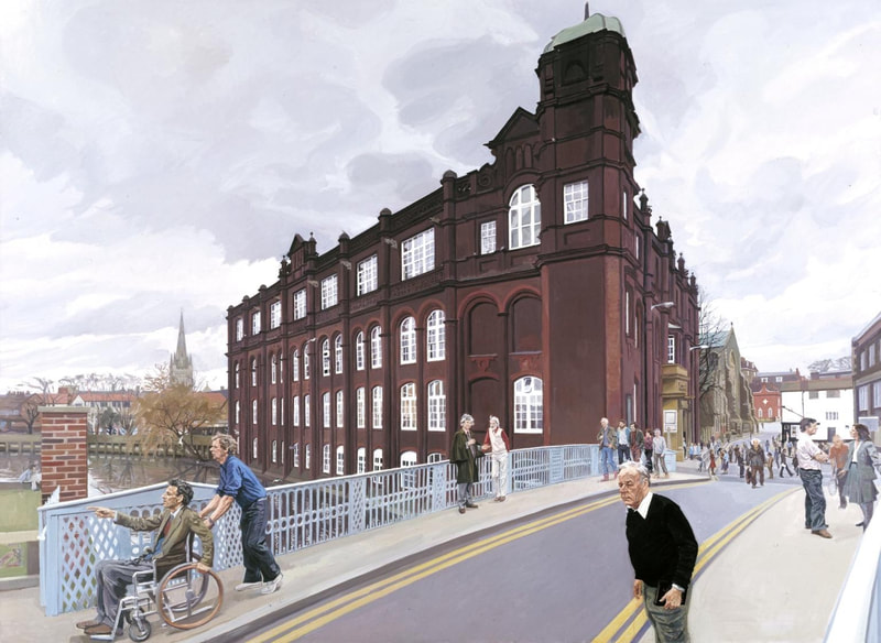
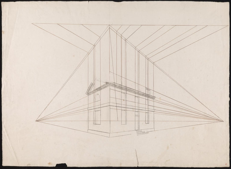
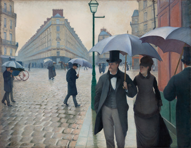
Once you have experimented with one-point perspective, look carefully at the pictures below. How does your eye read these differently?
From left: John Wonnacott, The Norwich School of Art (1982–4); Mallord William Turner, Tracing of a Perspective Construction of a House, c.1810; Gustave Caillebotte, Paris Street, Rainy Day, 1877
|
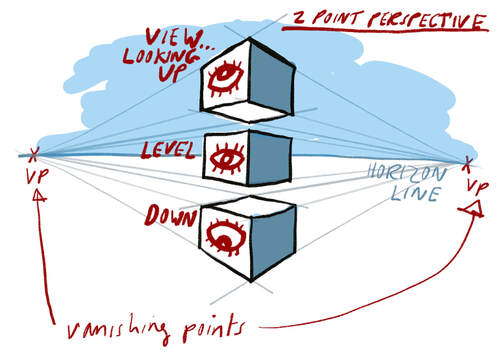
As the examples above show, it is also possible to draw in two-point perspective (or three, or four ...). For this, two vanishing points are added to the horizon line. Look at the illustration to help understand this.
Two point perspective is used if you are looking at the corner of a building or block rather than at a flat side. With one-point perspective your eye is led in one direction; with two-point perspective your eye is led two different ways. ACTIVITY
|
Now you have explored these various themes - flatness, scale, busyness, movement, viewpoints and perspectives - let's revisit a selection of illustrations by Michel Simeon, Joseph Schindelman, Faith Jaques and Quentin Blake. Click on these below to see larger versions.
- Which examples best use perspective to create a sense of depth, distance or scale?
- Which examples have the greatest sense of movement? How is this achieved?
- Which of these styles do you prefer, and why?
- Using these works as inspiration, what alternative scenes, locations, machinery or characters might you design?
ADDITIONAL READING
- Perspective Guide Tate Resources
- The History of Perspective Essential Vermeer
- Charlie and the Chocolate Factory illustration history Tyger Tales

